Your call-to-action choice makes a difference
One change made a big, bad difference in newsletter sign-ups from my website. Read what depressed my subscription numbers so you can avoid a similar fate.
Swapping newsletter for book box
A call-to-action (CTA) box with appealing text and an image boosts clicks by visitors to your website. That’s why my website redesign in 2012 added a CTA in the upper right corner. It invited you to receive a free report, Investment Writing Top Tips, when you subscribe to my e-newsletter.
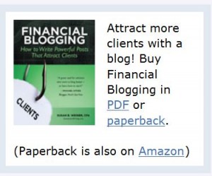
I swapped that newsletter box for a book box when I launched Financial Blogging: How to Write Powerful Posts that Attract Clients. It wasn’t a carefully thought-out move. Rather, I did it in a panic when I realized as I launched my book that it was hard to find the book on my website.  Selling the book was more important than adding newsletter subscribers. Plus, I figured I’d pick up subscribers from the call-to-action in my blog post footer.
Newsletter surprise
I was mildly surprised when my newsletter subscriptions didn’t spike during the month-long virtual book tour, which involved sharing guest posts on 26 blogs during August. Looking back I see that my weekly signups fell to an average of 11. But at the time I was too busy to notice. When I discovered this later, it didn’t square with my idea that the book tour would spur more visits to my website, which would spur more sign-ups.
The big surprise came after my virtual book tour ended. In the week ended Friday, September 13, I only added 6 new subscribers. Yikes! I can’t remember the last time prior to 2013 when my weekly new subscriber count fell below 10. That’s a scary number.
Trying for a comeback
To make my appeal for new subscribers more prominent in the week of September 16, I added an image of Investment Writing Top Tips to my blog footer. Until then, the footer consisted only of text.
Since then, my new subscriber counts have stayed in the double digits for all but three weeks. They even rose to 32/week when I published a guest post on MarketingProfs. I imagine they might be higher with a CTA box featuring the free e-book that folks receive when they subscribe. As I edit this post in December 2013, I’m averaging 14 new sign-ups/week.
I’m considering adding a second call-to-action box to my website. However, my web guy tells me that the right-hand column of my website is already too crowded. If he says that again, I’ll reconsider a low-key pop-up box that would slide across the bottom of my website and be easy to close. Yes, I know people hate pop-ups but they seem to work.
Or perhaps it’s time to swap my book CTA with the newsletter CTA now that the initial rush of book sales has ended.
Your thoughts?
If you’ve ever grappled with a call-to-action challenge, I’d like to hear from you—especially if you have advice for my newsletter subscriber predicament.


Susan, thanks for this great discussion on the importance of a single CTA element–and the reason to always be checking the data.
Pat, thank you for your comment! This was a real learning experience for me.
Great article Susan. It’s nice to know you actually check your sign-up stats – not a lot of people do!
I’d suggest testing this further. Whilst you have a CTA under your blog post, it still requires the viewer to click on a link. Then they’re taken to a page with a number of fields and options on it. I’d suggest making it as simple at possible – insert a signup box under your post with fields for their email address and name and the ‘submit’ button underneath. This way you’re reducing the number of clicks and information required to signup.
Also consider bringing back a signup box on the RHS sidebar. Although it’s good to promote book sales, you may find that building an email list is better in the long run – you can promote your book and any others you write via your list and autoresponder. You don’t have a very cluttered sidebar – there’s probably room for both in there.
Allan,
Thank you for your thoughtful comments!
I’ve been mulling over bringing back that signup box in the sidebar. I think it would boost my results. I also agree that eliminating steps and info would boost results, but I may not do that.
Susan, great discussion. Here are a couple of things to think about that might help.
1) If you need another CTA, you could try space at the top under the NAV. My company Blueleaf has had some success with that placement.
2) before I’d add another CTA, I would split (A/B) test the ones you have.
3) In testing CTA elements think of 3 things, headline, hero shot (image), action button in that order of importance.
Right now, the CTAs on this post have a very small headline compared with the surrounding text, also you’ve got a sort of subhead idea mixed but it’s hard to distinguish from the main headline.
Also your action “button” is a link. You should test something that looks like a button. They often convert at a higher rate.
Also, when I say split test, I mean do a test and then actually calculate the statistical impact of the variations. If you email me I can share the simple spreadsheet we use.
Hope that helps.
John,
Thank you for your detailed comments! When you say NAV, do you mean the navigation at the top of the page?
I’ll email you for your spreadsheet.
Hi Susan,
Do you track your conversions as a percentage of site traffic as well? (versus the absolute # of conversions in isolation). I’d be interested to know how you’re traffic was impacted by your virtual book tour.
What I’ve found is that making your primary offer the one with the lowest level of friction works best (i.e. the free offer) for starting the relationship and making those professionals on your list more comfortable purchasing something from you as they start hearing from you via email.
I’m a big fan of having your “lowest friction” level call-to-action as the main one on your site in order to get your site visitors into your database first. From there you can share content to bring them back to your site, find and follow them on social networks, and also educate them about your offerings via email.
With that said, I also think it’s a good idea to have a mid-level call-to-action (paid product) and a high-level call-to-action (i.e. consulting services) as well, but these do not have to be positioned as prominently.
I really believe the best and most loyal clients are either the ones referred to you (obvious), or they’ve had the chance to get to know, like, and trust you through your content and your newsletter. At least that’s been my experience over the last 4 years of trying to get this model down! Almost every financial advisor who purchased my post recent course had been a previous subscriber.
Stephanie
Stephanie,
Thank you for your thoughtful comments. I think you’re right about featuring the offer that’s easiest for people to embrace. Your questions about conversions make me think that I ought to spend more time on analysis, if only I could find the time.
My experience with signups for my financial blogging class was similar to yours. Almost every participant was a newsletter subscriber. Buyers of my book–to the extent that I have data about them–are more diverse. However, that makes sense because the cost is much lower.