Tag Archive for: newsletter tips

Stop being happy–and win more readers

Does the following sentence inspire you to dig into the writer’s newsletter?

The XYZ Financial team and I are happy to bring you this month’s newsletter.

It doesn’t inspire me. I doubt it inspires you. However, I often see financial professionals start their emails, letters, and newsletters with similar sentences. If they’re not “happy,” they’re “pleased,” “delighted” or something similar. This is so wrong. Stop being happy!

Why to stop being happy

stop being happyPlease stop talking about how great your content makes YOU feel.

Unless you’re writing to close family members or friends, no one cares about your emotions. They care about WIIFM—what’s in it for me, your reader. When you talk about your happiness you sacrifice the opportunity to appeal to their WIIFM.

In addition, focusing on YOUR emotions may make you seem self-centered or self-important. It’s as if you’re saying, “We are great. Bow down at our feet and worship us.” Okay, I’m exaggerating. Still, I hope you get the idea that I’m trying to communicate.

Your alternative to being happy

How else can a writer open their message? Start with something that solves a problem that your reader has. This will appeal to their WIIFM.

For example:

Curious about how the new tax law affects you? Avoid problems with the IRS by learning about the three things you may need to do differently, as covered in this month’s newsletter.

In addition to focusing on the reader’s WIIFM, this new introduction also gets to the point quickly. That’s essential to grabbing the attention of readers whose email inboxes are overcrowded.

Not sure how to identify your unhappy topic?

If you have trouble identifying your readers’ problems, read “Identifying ‘WHAT PROBLEM does this blog post solve for them?’” The same issues apply to blogs and newsletters. In fact, today’s newsletter articles often originate as blog posts.


Stop being happy and start attracting more readers and clients!

Image courtesy of stockimages/FreeDigitalPhotos.net

Boost your newsletter list’s power with this tip

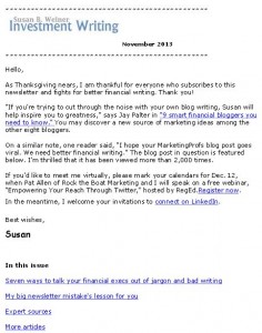
Nov 2013 newsletter page 1

Click to receive a free special report when you subscribe to my newsletters

If your newsletter is a good source of prospects who turn into clients, this tip can help you boost its effectiveness. Contact people who land on your “bounce” list when your newsletter stops reaching them. Your message is a gentle reminder of your availability. Plus, updating their email addresses means you’ll still be in touch with them once they feel a pressing need for your services or products.

I have at least one client whom I can directly attribute to this practice. A newsletter subscriber introduced me to the key people at his firm when the firm finally had a need for my services. This wouldn’t have happened if I hadn’t asked for the subscriber’s new email address after my newsletter bounced back from his email address at his previous job.

Another reason to follow up on bounces is because bounces hurt your email address’ reputation. This can reduce the deliverability of your emails.

Here’s a process you can follow:

  1. Assess why the email bounced. If an email bounced because the recipient’s inbox is full—and the bounce is a one-time event—you can wait to follow up. If your emails have been bouncing for awhile, it’s worth following up.
  2. Look at the individual’s LinkedIn profiles. If an individual has changed jobs, it’s obvious that you need a new email address. If there’s no change, it may be that the firm’s service provider is blocking your messages for some reason. Perhaps because your newsletters seem spammy or it doesn’t like your newsletter service provider. Sometimes I suggest that people re-subscribe from a personal email address, rather than battle their technology providers.
  3. Contact the person via a LinkedIn message, if you’re connected. You could try the email address in your database, but that so rarely works that I’ve given up trying that. Now I go straight to LinkedIn. I usually use a subject line along the lines of “May I update your email address?” I keep the body of the message short: “You subscribed to my Investment Writing newsletter, but it has been bouncing. May I update your email address?
  4. Try other methods if you’re not connected on LinkedIn. You can use LinkedIn InMail to contact people with whom you’re not connected, if you have a Premium account or pay a fee. You could also contact the individuals with a LinkedIn connection request, mentioning your newsletter. Or, you can go the firm’s website to see if you can figure out the person’s email address or use a contact form to reach them.
  5. Update your e-newsletter list. This means inputting new email addresses and removing the email addresses of people who don’t respond or who ask to be removed.


Follow these steps and you’ll boost your email deliverability and maybe even land some new business.

4 e-newsletter landing page tips from “Epic Content Marketing”

“10 Ways to optimize your e-newsletter landing page” is one tiny but useful section of Joe Pulizzi’s Epic Content Marketing. It’s important to craft your landing page—the newsletter’s signup page—effectively because, as Pulizzi writes, “your email database is a significant business asset.” Your email list is valuable because you control it in a way you can’t control social media connections.

Here are some tips from Pulizzi that will help you attract more people to your e-newsletter list because you convey the benefits of your content and make your signup easy to navigate.

Tip 1. Describe newsletter benefits

Explain how your prospect will benefit from subscribing to your newsletter, as Pulizzi suggests. For example, say how it’ll help them achieve financial peace of mind or otherwise improve their lives.

The benefits needn’t be limited to how your newsletter articles help readers. You can also offer a special report as an enticement for readers. That’s what I do with Investment Writing Top Tips.

Sharing testimonials or awards for your newsletter, another Pulizzi tip, also reinforces your newsletter’s benefits for the reader.

Tip 2. Make your landing page layout effective

Make it easy for readers to find your signup form on the page. This is why it’s important to “bring the signup above the fold,” as Pulizzi suggests, so it is visible without the reader scrolling down the page. You can view my newsletter signup page for an example of positioning.

Pulizzi also suggests that your signup should “include a button that says ‘subscribe’ or ‘sign up’ (not submit),” taking advantage of words with positive connotations.

Put less important information farther down the page. This includes a privacy statement, which is still essential. Pulizzi also suggests that you tell subscribers “what you will and won’t do with their information. This can go bottom of your page,” says Pulizzi.

Another design tip is to rid your newsletter page of anything that might distract the reader from signing up, says Pulizzi.

Tip 3. Show readers what they’ll getNov 2013 newsletter page 1

Pulizzi suggests that you show readers a picture of your newsletter. I think he means a small image of your newsletter’s first page (see example of my newsletter on the right) or maybe just a table of contents.

Also, link to a sample newsletter. Until recently, I’ve handled this by providing an archive of my monthly newsletters, instead of one sample that I’d need to update periodically.

Tip 4. Limit your newsletter sign-up form’s fields

Limit the number of fields in your newsletter sign-up form. As Pulizzi says, “ the fewer fields, the more likely prospects will be to sign up.”

When I started my newsletter I required only two fields, first name and email address. Now that I’m more confident of my newsletter’s appeal, I request, but don’t require, last names and company names.

Pulizzi’s book as a content marketing resource

If you’re new to content marketing, Epic Content Marketing offers a great overview of content marketing’s many components. It suggests steps that the reader can take to launch their content marketing strategy and manage their content process. There’s information for more experienced marketers too. I noticed some items for action, such as checking out the persona creation tool at upcloseandpersona.com. I’d also like to take a more analytical look at my content strategy.

As a writer, I noticed that some of the writing isn’t as tight as I’d like. For example, information that’s presented as a series of nine bullets screams for a rewrite. Too many bullet points exhaust the reader.

On balance, I enjoyed the book because it made me think.

Disclosures: I received a free copy of this book from McGraw Hill in return for agreeing to mention it in my blog. If you click on the Amazon link in this post and then buy something, I will receive a small commission. I only link to books in which I find some value for my blog’s readers.

Your call-to-action choice makes a difference

One change made a big, bad difference in newsletter sign-ups from my website. Read what depressed my subscription numbers so you can avoid a similar fate.

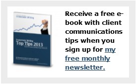
Swapping newsletter for book boxcall to action box

A call-to-action (CTA) box with appealing text and an image boosts clicks by visitors to your website. That’s why my website redesign in 2012 added a CTA in the upper right corner. It invited you to receive a free report, Investment Writing Top Tips, when you subscribe to my e-newsletter.

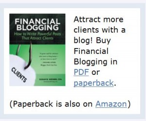
I swapped that newsletter box for a book box when I launched Financial Blogging: How to Write Powerful Posts that Attract Clients. It wasn’t a carefully thought-out move. Rather, I did it in a panic when I realized as I launched my book that it was hard to find the book on my website. Book call-to-action boxSelling the book was more important than adding newsletter subscribers. Plus, I figured I’d pick up subscribers from the call-to-action in my blog post footer.

Newsletter surprise

I was mildly surprised when my newsletter subscriptions didn’t spike during the month-long virtual book tour, which involved sharing guest posts on 26 blogs during August. Looking back I see that my weekly signups fell to an average of 11. But at the time I was too busy to notice. When I discovered this later, it didn’t square with my idea that the book tour would spur more visits to my website, which would spur more sign-ups.

The big surprise came after my virtual book tour ended. In the week ended Friday, September 13,  I only added 6 new subscribers. Yikes! I can’t remember the last time prior to 2013 when my weekly new subscriber count fell below 10. That’s a scary number.

Trying for a comeback

To make my appeal for new subscribers more prominent in the week of September 16, I added an image of Investment Writing Top Tips to my blog footer. Until then, the footer consisted only of text.

Since then, my new subscriber counts have stayed in the double digits for all but three weeks. They even rose to 32/week when I published a guest post on MarketingProfs. I imagine they might be higher with a CTA box featuring the free e-book that folks receive when they subscribe. As I edit this post in December 2013, I’m averaging 14 new sign-ups/week.

I’m considering adding a second call-to-action box to my website. However, my web guy tells me that the right-hand column of my website is already too crowded. If he says that again, I’ll reconsider a low-key pop-up box that would slide across the bottom of my website and be easy to close. Yes, I know people hate pop-ups but they seem to work.

Or perhaps it’s time to swap my book CTA with the newsletter CTA now that the initial rush of book sales has ended.

Your thoughts?

If you’ve ever grappled with a call-to-action challenge, I’d like to hear from you—especially if you have advice for my newsletter subscriber predicament.