Tag Archive for: e-newsletters

Pick your e-newsletter sender name carefully

Recently, I sent the newsletter of a person whom I like to my email’s spam folder. My gut reaction proves that you should clearly identify the sender of your email newsletter.

Unrecognizable sender name spells trouble

When I looked at the newsletter, I thought, “I don’t know this person. Why is he sending this to me?” I also had a vague sense that I’d received multiple issues of this unwanted newsletter.

When I receive newsletters from people whose names I don’t recognize, I’m afraid to click their “unsubscribe” links. I’m concerned that my confirming the existence of my email, I’m sentencing myself to receive more newsletter spam. That’s why I sent this person’s email to my spam folder.

The sender used only his first name in his “from” line. It’s as if I identified myself simply as “Susan” instead of “Susan Weiner, CFA” in the from line of my e-newsletter. I had no idea who he was—at least, not initially. But the name nagged at me. Eventually, I realized from the person’s mailing address that I did know him. But, by then it was too late for me to undo his spam designation.

As Campaign Monitor says in “Why ‘From’ names and email addresses are important,

Studies on email open rates have found that trusting the sender is the single most important factor in whether an email is opened or not. That means it’s critical to choose an effective and consistent “From” name and email address.

A better approach to your sender name

If you’re a solopreneur sending an e-newsletter, consider using your full name—first name plus surname—as your sender name. In the example I give above, I would have recognized the full name. I wouldn’t have sent the newsletter to spam.

Sometimes a full name isn’t enough to jog my memory. Even adding a company name to your sender name often isn’t enough. “10 Tips to Optimize Your Newsletter’s Sender Address” by Newsletter2go offers some tips on picking the right sender name. I don’t believe that you should always use your company name as your sender name, as I discussed in “Should my firm insert its name at the start of every email subject line?

The best way to avoid getting sent to spam for an unrecognized sender name is to stop adding people to your email lists without their permission.

It also helps to deliver value in every newsletter. However, everyone defines value differently, so that’s hard to do consistently.

The e-newsletter problem you don’t know about

Don’t get me wrong. Sending an e-newsletter is a great idea. I’ve gained thousands of dollars of business from my subscribers. But there’s an e-newsletter problem nobody tells you about.

The problem? Delivery.

Your newsletters may fail to reach your subscribers’ in-boxes for reasons that have little to nothing to do with you. You can avoid some, but not all of these problems, by using a provider of e-newsletter services—like Constant Contact, MailChimp, or aWeber—instead of sending your newsletter via your email client, as I discussed in “Do NOT send your newsletter via your email.” But you’ll experience problems even with those providers.

Bounce list reveals problem

You may think that all of your newsletters are reaching your subscribers. But they’re not. For one thing, some subscribers divert your newsletters from their inbox using rules to divert them to other folders. An email provider like Gmail may direct your newsletters on its own initiative to a separate tab called Promotions. Also, some subscribers may forget they subscribed and mark your newsletter as spam. That’s for starters.

There’s more, which I discovered from going through my newsletter’s “bounce list,” a list of subscribers whom Constant Contact says didn’t receive my newsletters.

Every month I go through the “bounce list” for my monthly and weekly newsletters. Sometimes the bounces are temporary, as when an inbox gets overloaded while someone is out of the office. Other times, though not too often, the bounce reports are false, as I discover when I contact the bounced email addresses, and my subscribers say, “Susan, I’m getting your newsletters. I just read one.”

I think the most typical reason for bounces is that the subscriber’s company or internet service provider (ISP) blocks e-newsletters. There are ways for subscribers to request that their company of ISP allow your newsletter through. But that can be time-consuming for the subscriber.

One of my most surprising discoveries was that it can take years for an invalid email address to bounce. I only learn this when I go the person’s LinkedIn profile to contact them about a bounce, and I see they left their job long ago. Apparently, some companies don’t immediately deactivate email addresses of employees who leave. I can see keeping an email address active for one to three months. Keeping it active for one to three years, without even activating an autoresponder about the person’s departure, seems crazy to me.

What’s the fix?

There is no easy fix to this e-newsletter problem. One approach is to chip away gradually at undelivered emails by contacting subscribers on your bounce list. Ask them to update their email addresses or take other measures to ensure your newsletter reaches them. There can be a silver lining to this practice, as I discussed in “Boost your newsletter list’s power with this tip.”

Another approach is to periodically review lists of newsletter non-openers. You can then contact those who’ve been inactive for a prolonged period, asking if they’d like to unsubscribe. I’ve made a step in that direction, but I’ve found that identifying longtime inactive subscribers is a clunky, hands-on process with Constant Contact. Other providers may make it easier. For example, I believe some providers make it possible to generate a list of those who haven’t opened a newsletter for X number of months. Last time I checked, Constant Contact didn’t offer that feature.

Have YOU found a better fix to this problem? If so, I’d love to hear from you.


Do NOT send your newsletter via your email

Are you thinking of starting a newsletter and sending it via your firm’s email? Stop. Sending newsletters using your firm’s email client—whether it’s Microsoft Outlook or some other program—is a bad idea. It can anger people, and handicap the delivery of your newsletter. But, don’t worry. There’s an easy solution.

An easy way to annoy newsletter recipients

I’m thinking about this because I just received a mass email from someone who’s launching a new business. This person emailed me—and maybe 20 other people—in a message that displayed our emails in the CC line.

It’s not a good idea to expose other people’s email addresses if they don’t already work at the same company or correspond via email for other purposes. People like their privacy. In the case that I’m thinking of, the other recipients were all people who had taken a class together, so many of them may have welcomed the chance to stay in touch. But some might not.

Another problem: When you send a mass email using the CC line, inevitably some people will “respond all.” That’s true even when their message is of no interest to the other recipients. This is annoying.

A way to handicap your newsletter delivery

You might think that using the BCC line to blind-copy recipients would solve your problems. Sure, it’ll solve the problems listed above. But there are other issues with sending newsletters via your firm’s email software.

Internet service providers (ISPs) are suspicious of emails that have many addressees. They fear that you might be sending spam. Your email address could get blacklisted.

As e-mail marketing application MailChimp says in its explanation of blacklists, “If your emails get marked as spam, or ISPs see a sudden increase in email volume coming from your domain, you could get blacklisted.” Campaign Monitor, another email marketing app, notes that “Just a few spam complaints can land an IP address on a blacklist, even if the ratio of complaints to the volume of email sent is very low.” 

That could hurt the delivery of your regular emails as well as your newsletters. That’s a high price to pay.

Solution: use an email marketing application

An email marketing application—I use Constant Contact—solves the problem of exposing recipient’s email addresses. It also gives your newsletter the chance to be viewed more favorably by ISPs than emails sent to many recipients via your firm’s email software.

For one thing, an email marketing app will make sure that you comply with certain standards set by the CAN-SPAM Act, an anti-spam law. It’ll force you to provide an unsubscribe link and to put your address in the email, as pointed out in “7 Reasons You Should Use An Email Marketing Service to Send Your Newsletters.” The same article asserts that “Email service providers such as Constant Contact and MailChimp are trusted within the email community and they keep a good eye on their account holders to make sure there is no funny business going on.” As Liz Lockard says in “5 Reasons Why Email Marketing Service Providers are a MUST,” “They keep a record of the opt-in when your subscriber signs up and also have things like spam filter checks to help you avoid the junk folder and being reported as spam.”

Other advantages of email marketing service providers:

  • They give you the option to automate sign-ups to your newsletter with a link in your emails, on your website, or in other locations.
  • They provide templates to help you format your newsletters attractively—and in a mobile-friendly way.
  • They usually offer some sort of support, which can be invaluable when you run into problems with your newsletter.

You may still have problems

I wish I could say that email marketing service providers are the solution to all of your problems. They’re not.

Some companies block communications sent via such providers. I’ve run into this with subscribers to my Investment Writing newsletter. Some of my subscribers end up re-subscribing from their home email addresses, rather than battling their company information technology folks to get the newsletter whitelisted.

Still, if you follow my advice, you’re likely to have fewer problems than if you send newsletters via your regular email software.


My newsletter experiment with confirmation requests

I suspect that a significant percentage of my newsletters don’t make it into my subscribers’ email in-boxes. Every month I get a list of email addresses that “bounce,” not reaching their destination. An even larger number of subscribers fail to open any emails—possibly because my emails aren’t reaching them. The data is provided by Constant Contact, the provider I use for sending my newsletters.

Newsletter confirmations

Wondering if the disappointing numbers are partly because new subscribers input bad email addresses, I experimented with Constant Contact’s feature that requires new subscribers to confirm their interest before they join my list.

I didn’t like the results. My weekly list of new subscribers shrank. Also, the list of names in an “Awaiting confirmation” category grew. Looking at the email addresses on the “Awaiting confirmation” list, I saw many email addresses that appeared legitimate.

My assistant suggested that the confirmation-request email went into the individuals’ spam folders. That’s what happened when she tested the feature by subscribing to my newsletter. (Of course, it’s possible that’s where anything sent via Constant Contact goes for those individuals unless they’ve whitelisted Constant Contact.)

I asked Constant Contact if I could re-send the confirmation-request email. No, there’s no way to do that.

Asking people to re-enter subscriptions

The only way I can get those subscribers on my Constant Contact list is to send them an email asking them to re-enter their subscription request. I sent 25 requests in early January. It’ll be interesting to see how many of those people re-subscribe by the time I publish this article.

In the meantime, I’ve turned off Constant Contact’s confirmation request.

Financial e-newsletters, kill your annoying, weak clickbait!

Some financial e-newsletters drive me crazy. I click to open them and find nothing there. Well, not nothing, but just enough to annoy the heck out of me.

If you’re doing what these newsletters do, please stop.

The most annoying habit of financial e-newsletters that I actually open

If I actually open a financial e-newsletter, I expect it to have some content. The body of the newsletter shouldn’t simply consists of links leading elsewhere.

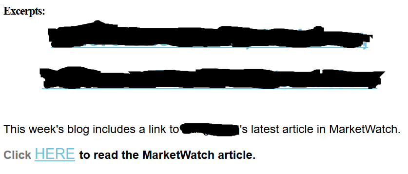
Below is an example of a newsletter that failed the test. The first two blacked-out lines are the title of a blog post formatted as a clickable link. I’m concealing the firm’s identity because I assume this is an innocent mistake on their part. It’s the kind of thing that happens when non-professional writers create content.

annoying financial e-newsletters: an example

This is the only text that appeared in the main body of a financial e-newsletter that I received.


I think that the e-newsletter senders hoped that their links would serve as clickbait—provocative content that drives readers to a web page. However, the title of a blog post written by financial professional rarely has the flair to do that.

The senders could have achieved better results by adding a brief summary or introduction to their article on MarketWatch. That would have let me assess whether their topic interested me.

I understand that the authors probably are limited in how much they can copy from their MarketWatch article. However, that shouldn’t prevent them from writing teaser copy or saying “If you’re a ___ type of investor, this article can help you to ____.”

The second offense by this financial e-newsletter

clickbaitWhen I clicked on the two blacked-out lines, which are clearly meant to be clickable links, they took me to a post on the company’s blog. The content on the page? Exactly what you see in the image above.
Oops! I had to click again to reach the article on MarketWatch. What casual reader is going to take all of these steps with so little indication in the e-newsletter of what benefit they’ll gain from their clicks?

I understand that people want to drive traffic to their websites. But balance that against the risk that along the way you’ll annoy and lose readers for your financial e-newsletters.

I think the newsletter senders in this case should have linked directly to their post on MarketWatch. They would have avoided annoying me by sending me to their blog post that didn’t add anything new. Also, even without the link to their website, they would have learned whether their title was strong enough to interest me. Most newsletter programs allow you to measure your readers’ click. Although their measurements aren’t 100 percent accurate, they’ll tell you if one title attracts more readers than another.

Mistakes by other financial e-newsletters

What else do financial e-newsletters do to annoy or drive away readers? They:

  1. Add people to their newsletter distribution lists without asking permission, as I’ve discussed in “no, No, NO: My business card shouldn’t add me to your e-newsletter list” and “Our LinkedIn connection isn’t an invitation to spam.”
  2. Use weak subject lines in their emails. For an analysis of a weak title and how to spice it up, read “Stop! Get a better title, or forget winning readers.”
  3. Send newsletters that aren’t mobile-friendly. Today people are often read emails on their phones and other mobile devices that fail to display traditional e-newsletter formats effectively. For tips on how to be mobile-friendly, see “3 ways to make your emails mobile-friendly.”

They may also suffer from “4 reasons your emails don’t get results.”

Image courtesy of adamr/FreeDigitalPhotos.net

Our LinkedIn connection isn’t an invitation to spam

I don’t like it when anybody adds me to an ongoing e-newsletter distribution list without asking my permission—or at least warning me that my signing up for their freebie will add me to that list. If you’re doing that, please reconsider.

The newest variation on this may be people who add their new LinkedIn connections to email lists without permission. If you do this, you’re sending me spam. Please stop.

I’m thinking about this because of a recent experience. I felt fine when I received one email communication from a new LinkedIn connection with the subject line, “Thank you for connecting on LinkedIn.” I admired my connection for making the time to follow up. I was impressed that he took the time to create an attractively formatted email, including photographs, using an e-mail newsletter program. I even forwarded the email to a friend whom I thought might learn from how the man promoted his book in his email. This kind of email is fine with me, if it happens one time only. Indeed, I welcome genuine, personalized messages from people with whom I connect.

However, I felt angry when the connection repeated the same email one month later. I realized that he had added me to a newsletter list without my permission. I think this bothered me more than the average involuntary newsletter subscription because the sender reused the email he’d sent one month earlier. A message with new content might have shown more respect for my time.

By the way, if you add me to my newsletter without my permission, I may not unsubscribe, but I will implement an email rule that sends your message to a “Newsletter” folder. Your message never hits my main inbox.

Image courtesy of Stuart Miles at FreeDigitalPhotos.net

How and Why to Use Sliding Pop-ups

Email lists are a key part of online marketing for financial advisors—and for me, too. I was intrigued when advisor Dave Grant told me on Facebook that he was using a sliding pop-up with a chat function to get more mileage out of his website. His guest post below resulted from our discussion.

How and Why to Use Sliding Pop-ups

By Dave Grant

One problem advisors have is building a credible email list in order to share their thoughts with a list of prospects to ultimately gain new business. The old way was meeting someone and then asking to add them to your mailing list. But in the age of more interaction online, you need a way to capture visitor information of those whom you may never meet in person. This is where pop-ups come in.

By offering a newsletter / free report / video series for visitors to your website, you can obtain their names and email addresses to add them to your list and, potentially, a drip marketing campaign. However, static opt-in boxes are often ignored, so how do you get that valuable information?

It may be time to use a pop-up. Pop-ups on websites can be annoying, but they have been proven by multiple marketing studies to increase visitor engagement through newsletter opt-ins because they are dynamic on the page. Instead of a pop-up in the middle of the screen, there is now an alternative that’s less annoying but still effective: the sliding pop-up.

Usually situated in the bottom left- or right-hand corner of a website, this box can transition in after a set period of time or when someone hits the end of the page, making readers notice the opt-in box. However, it’s not annoying like a traditional pop-up that blocks the reader’s view of the screen. When you use your company’s branding on these opt-in forms, they look like an extension of your site rather than a standard opt-in form. Many advisors find pop-ups increase their newsletter opt-in rates.

I’ve taken the pop-up one step further by adding a chat program.

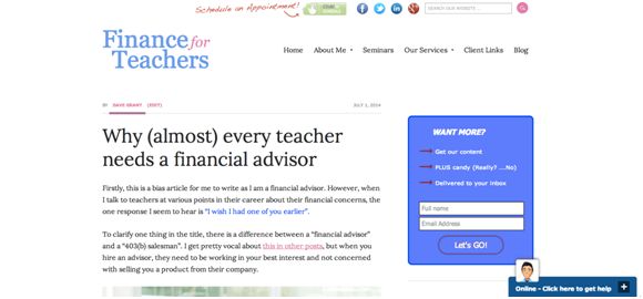
While I still have static opt-in forms on throughout my site, I use the sliding pop-up on the bottom of my screen with a chat program. When people get to the end of an article, or after a set time period, the chat box slides up and I introduce myself with template text. From there, people can ask questions and interact with me in real time. Look at the image to see a screenshot of the initial view of my pop-up. Notice “Click here to get help” in the lower right-hand corner? That’s where you can start to chat with me.

finance for teachers

I’ve seen my conversations, not just opt-ins, with potential clients increase dramatically using this method. Now my website averages one good prospect conversation per week instead of the one per month I gained from the “Schedule an Appointment” button on my website.

If you’re wondering how to implement this strategy, there are many sliding pop-up options for advisors who use WordPress. You can download them as a plugin and adjust the wording yourself. To add your firm’s branding may require a web designer to write some code. Some options include AppSumo List Builder, Bounce Exchange, and OptIn Monster. There are also free options.

For my chat pop-up, I use ClickDesk. I like that it sends a chat transcript to my email once the chat closes.

____________

Dave Grant, CFP(R) is the founder of Finance of Teachers, a fee-only financial planning firm in Cary, IL, serving teachers, primarily in Illinois. He is also a columnist for Financial Planning magazine, writing about issues facing Gen Y advisors. His recent book “The First Year” discusses the challenges of the first year of running his RIA, tips on how to be successful, and is available on Amazon KindleiBook, and through The Mercato.

Boost your newsletter list’s power with this tip

Nov 2013 newsletter page 1

Click to receive a free special report when you subscribe to my newsletters

If your newsletter is a good source of prospects who turn into clients, this tip can help you boost its effectiveness. Contact people who land on your “bounce” list when your newsletter stops reaching them. Your message is a gentle reminder of your availability. Plus, updating their email addresses means you’ll still be in touch with them once they feel a pressing need for your services or products.

I have at least one client whom I can directly attribute to this practice. A newsletter subscriber introduced me to the key people at his firm when the firm finally had a need for my services. This wouldn’t have happened if I hadn’t asked for the subscriber’s new email address after my newsletter bounced back from his email address at his previous job.

Another reason to follow up on bounces is because bounces hurt your email address’ reputation. This can reduce the deliverability of your emails.

Here’s a process you can follow:

  1. Assess why the email bounced. If an email bounced because the recipient’s inbox is full—and the bounce is a one-time event—you can wait to follow up. If your emails have been bouncing for awhile, it’s worth following up.
  2. Look at the individual’s LinkedIn profiles. If an individual has changed jobs, it’s obvious that you need a new email address. If there’s no change, it may be that the firm’s service provider is blocking your messages for some reason. Perhaps because your newsletters seem spammy or it doesn’t like your newsletter service provider. Sometimes I suggest that people re-subscribe from a personal email address, rather than battle their technology providers.
  3. Contact the person via a LinkedIn message, if you’re connected. You could try the email address in your database, but that so rarely works that I’ve given up trying that. Now I go straight to LinkedIn. I usually use a subject line along the lines of “May I update your email address?” I keep the body of the message short: “You subscribed to my Investment Writing newsletter, but it has been bouncing. May I update your email address?
  4. Try other methods if you’re not connected on LinkedIn. You can use LinkedIn InMail to contact people with whom you’re not connected, if you have a Premium account or pay a fee. You could also contact the individuals with a LinkedIn connection request, mentioning your newsletter. Or, you can go the firm’s website to see if you can figure out the person’s email address or use a contact form to reach them.
  5. Update your e-newsletter list. This means inputting new email addresses and removing the email addresses of people who don’t respond or who ask to be removed.


Follow these steps and you’ll boost your email deliverability and maybe even land some new business.

4 e-newsletter landing page tips from “Epic Content Marketing”

“10 Ways to optimize your e-newsletter landing page” is one tiny but useful section of Joe Pulizzi’s Epic Content Marketing. It’s important to craft your landing page—the newsletter’s signup page—effectively because, as Pulizzi writes, “your email database is a significant business asset.” Your email list is valuable because you control it in a way you can’t control social media connections.

Here are some tips from Pulizzi that will help you attract more people to your e-newsletter list because you convey the benefits of your content and make your signup easy to navigate.

Tip 1. Describe newsletter benefits

Explain how your prospect will benefit from subscribing to your newsletter, as Pulizzi suggests. For example, say how it’ll help them achieve financial peace of mind or otherwise improve their lives.

The benefits needn’t be limited to how your newsletter articles help readers. You can also offer a special report as an enticement for readers. That’s what I do with Investment Writing Top Tips.

Sharing testimonials or awards for your newsletter, another Pulizzi tip, also reinforces your newsletter’s benefits for the reader.

Tip 2. Make your landing page layout effective

Make it easy for readers to find your signup form on the page. This is why it’s important to “bring the signup above the fold,” as Pulizzi suggests, so it is visible without the reader scrolling down the page. You can view my newsletter signup page for an example of positioning.

Pulizzi also suggests that your signup should “include a button that says ‘subscribe’ or ‘sign up’ (not submit),” taking advantage of words with positive connotations.

Put less important information farther down the page. This includes a privacy statement, which is still essential. Pulizzi also suggests that you tell subscribers “what you will and won’t do with their information. This can go bottom of your page,” says Pulizzi.

Another design tip is to rid your newsletter page of anything that might distract the reader from signing up, says Pulizzi.

Tip 3. Show readers what they’ll getNov 2013 newsletter page 1

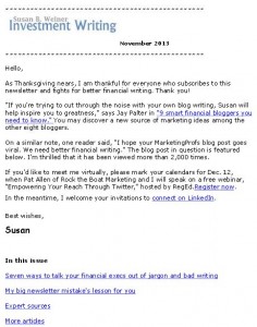
Pulizzi suggests that you show readers a picture of your newsletter. I think he means a small image of your newsletter’s first page (see example of my newsletter on the right) or maybe just a table of contents.

Also, link to a sample newsletter. Until recently, I’ve handled this by providing an archive of my monthly newsletters, instead of one sample that I’d need to update periodically.

Tip 4. Limit your newsletter sign-up form’s fields

Limit the number of fields in your newsletter sign-up form. As Pulizzi says, “ the fewer fields, the more likely prospects will be to sign up.”

When I started my newsletter I required only two fields, first name and email address. Now that I’m more confident of my newsletter’s appeal, I request, but don’t require, last names and company names.

Pulizzi’s book as a content marketing resource

If you’re new to content marketing, Epic Content Marketing offers a great overview of content marketing’s many components. It suggests steps that the reader can take to launch their content marketing strategy and manage their content process. There’s information for more experienced marketers too. I noticed some items for action, such as checking out the persona creation tool at upcloseandpersona.com. I’d also like to take a more analytical look at my content strategy.

As a writer, I noticed that some of the writing isn’t as tight as I’d like. For example, information that’s presented as a series of nine bullets screams for a rewrite. Too many bullet points exhaust the reader.

On balance, I enjoyed the book because it made me think.

Disclosures: I received a free copy of this book from McGraw Hill in return for agreeing to mention it in my blog. If you click on the Amazon link in this post and then buy something, I will receive a small commission. I only link to books in which I find some value for my blog’s readers.

Your call-to-action choice makes a difference

One change made a big, bad difference in newsletter sign-ups from my website. Read what depressed my subscription numbers so you can avoid a similar fate.

Swapping newsletter for book boxcall to action box

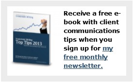
A call-to-action (CTA) box with appealing text and an image boosts clicks by visitors to your website. That’s why my website redesign in 2012 added a CTA in the upper right corner. It invited you to receive a free report, Investment Writing Top Tips, when you subscribe to my e-newsletter.

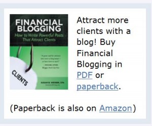
I swapped that newsletter box for a book box when I launched Financial Blogging: How to Write Powerful Posts that Attract Clients. It wasn’t a carefully thought-out move. Rather, I did it in a panic when I realized as I launched my book that it was hard to find the book on my website. Book call-to-action boxSelling the book was more important than adding newsletter subscribers. Plus, I figured I’d pick up subscribers from the call-to-action in my blog post footer.

Newsletter surprise

I was mildly surprised when my newsletter subscriptions didn’t spike during the month-long virtual book tour, which involved sharing guest posts on 26 blogs during August. Looking back I see that my weekly signups fell to an average of 11. But at the time I was too busy to notice. When I discovered this later, it didn’t square with my idea that the book tour would spur more visits to my website, which would spur more sign-ups.

The big surprise came after my virtual book tour ended. In the week ended Friday, September 13,  I only added 6 new subscribers. Yikes! I can’t remember the last time prior to 2013 when my weekly new subscriber count fell below 10. That’s a scary number.

Trying for a comeback

To make my appeal for new subscribers more prominent in the week of September 16, I added an image of Investment Writing Top Tips to my blog footer. Until then, the footer consisted only of text.

Since then, my new subscriber counts have stayed in the double digits for all but three weeks. They even rose to 32/week when I published a guest post on MarketingProfs. I imagine they might be higher with a CTA box featuring the free e-book that folks receive when they subscribe. As I edit this post in December 2013, I’m averaging 14 new sign-ups/week.

I’m considering adding a second call-to-action box to my website. However, my web guy tells me that the right-hand column of my website is already too crowded. If he says that again, I’ll reconsider a low-key pop-up box that would slide across the bottom of my website and be easy to close. Yes, I know people hate pop-ups but they seem to work.

Or perhaps it’s time to swap my book CTA with the newsletter CTA now that the initial rush of book sales has ended.

Your thoughts?

If you’ve ever grappled with a call-to-action challenge, I’d like to hear from you—especially if you have advice for my newsletter subscriber predicament.