Your call-to-action choice makes a difference
One change made a big, bad difference in newsletter sign-ups from my website. Read what depressed my subscription numbers so you can avoid a similar fate.
Swapping newsletter for book box
A call-to-action (CTA) box with appealing text and an image boosts clicks by visitors to your website. That’s why my website redesign in 2012 added a CTA in the upper right corner. It invited you to receive a free report, Investment Writing Top Tips, when you subscribe to my e-newsletter.
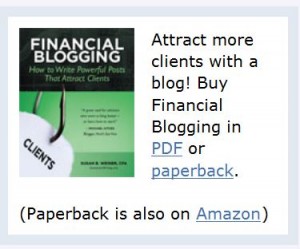
I swapped that newsletter box for a book box when I launched Financial Blogging: How to Write Powerful Posts that Attract Clients. It wasn’t a carefully thought-out move. Rather, I did it in a panic when I realized as I launched my book that it was hard to find the book on my website.  Selling the book was more important than adding newsletter subscribers. Plus, I figured I’d pick up subscribers from the call-to-action in my blog post footer.
Newsletter surprise
I was mildly surprised when my newsletter subscriptions didn’t spike during the month-long virtual book tour, which involved sharing guest posts on 26 blogs during August. Looking back I see that my weekly signups fell to an average of 11. But at the time I was too busy to notice. When I discovered this later, it didn’t square with my idea that the book tour would spur more visits to my website, which would spur more sign-ups.
The big surprise came after my virtual book tour ended. In the week ended Friday, September 13, I only added 6 new subscribers. Yikes! I can’t remember the last time prior to 2013 when my weekly new subscriber count fell below 10. That’s a scary number.
Trying for a comeback
To make my appeal for new subscribers more prominent in the week of September 16, I added an image of Investment Writing Top Tips to my blog footer. Until then, the footer consisted only of text.
Since then, my new subscriber counts have stayed in the double digits for all but three weeks. They even rose to 32/week when I published a guest post on MarketingProfs. I imagine they might be higher with a CTA box featuring the free e-book that folks receive when they subscribe. As I edit this post in December 2013, I’m averaging 14 new sign-ups/week.
I’m considering adding a second call-to-action box to my website. However, my web guy tells me that the right-hand column of my website is already too crowded. If he says that again, I’ll reconsider a low-key pop-up box that would slide across the bottom of my website and be easy to close. Yes, I know people hate pop-ups but they seem to work.
Or perhaps it’s time to swap my book CTA with the newsletter CTA now that the initial rush of book sales has ended.
Your thoughts?
If you’ve ever grappled with a call-to-action challenge, I’d like to hear from you—especially if you have advice for my newsletter subscriber predicament.
