Guest post: “Boost Chart Impact with Interpretation”
Marketing communications consultant Susan Becker and I met through LinkedIn. I’ve enjoyed many exchanges with her about how to communicate more effectively. Her guest post focuses on making the most of charts.
Boost Chart Impact with Interpretation
By Susan K. Becker
Because most people digest information visually rather than verbally, we are urged to stop relying on bullet points and, instead, to present information visually. For  financial writers, this often means presenting complex data in charts.
Unfortunately, in communicating visually, we often tend to sacrifice the verbal interpretation necessary to make the data easily understood. This post discusses two techniques to remedy the misleading assumption that “the numbers speak for themselves.” They result in charts that engage your audience and advance the story revealed in your data.
These techniques are:
- Interpretive titles that communicate the overall point of each chart, instead of just labeling what is shown (e.g., quarterly returns)
- Labels and call-outs that bring attention to what the reader should take away
I should point out that this post discusses investment writing using text with charts. We should design for the medium, so the suggestions here would be modified for a slide presentation that is projected or web-based.
1. Use interpretive titles
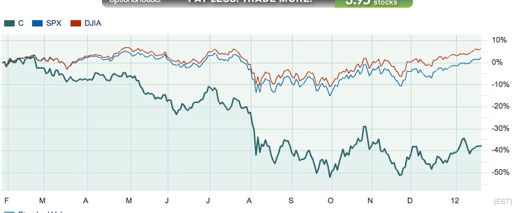
Marketwatch interactive charts offer abundant choices for presenting data. The chart below compares a stock’s 12-month stock performance against the SPX and DJIA.
The chart needs an interpretive title explaining its overall point, instead of a label like “12-month Performance.” A good question is, “What is its overall point?” The chart tells several stories: e.g., “Stock performance increasingly lagged the indexes, as the year went on”; or, “Stock performance declined sharply in August and ended the year at the same level.”
Use the interpretive title that furthers your message. For example, if your story focuses on ROI, you would want a title explaining “Stock X’s performance turned negative in March and continued to diverge from the indexes, ending the year deep under water.”
2. Use interpretive labels and call-outs
Verbally signaling key data is another useful technique for the text-and-charts format, which accommodates more visual elements than slides projected during a presentation. The chart below tells the story of a web industry segment’s roughly one-year wild ride, 3Q99 through 4Q00, in a simple line chart made eloquent by interpretive notes. 
If you have less white space, overlay the text in call-outs (click “Shapes” in Word and PowerPoint).
Susan K. Becker provides consulting and coaching in marketing communication and presentations at Manhattan-based Becker Consulting Services. View her work at http://www.slideshare.net/SusanKBecker and follow her on Twitter @SKBeckerCoach.


Susan Becker, it is so true that the numbers do NOT speak for themselves. You’ve given folks an important reminder. Thank you!
Thanks so much for noticing the comment about how numbers don’t speak for themselves. It’s a pet belief and was my unofficial title for my communication course for Finance majors developed and offered for MBA students at NYU.