Reader challenge: What makes advisor websites outstanding?
What do YOU think makes for an outstanding advisor website? Please share your thoughts below.
Advisor-recommended websites to spark discussion
I recently asked my readers for examples of outstanding money manager websites. Below you’ll find screen shots with links to the home pages for their recommendations. Plus, I’ve linked to the sites of the two people who made recommendations.
Tell me what you like about these sites. Do they do things you’d like more advisors to do?
To facilitate discussion I’ve numbered the websites, which are listed in alphabetical order. I’ve also shared at least one of my impressions of the site. But my comments are not comprehensive.
1. Capri Capital Partners
Nice clean look. Good tag line.
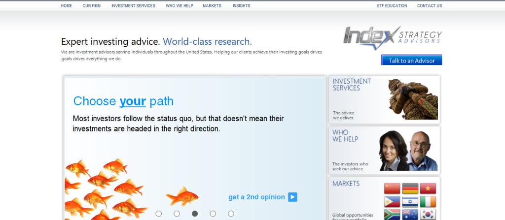
2. Index Strategy Advisors
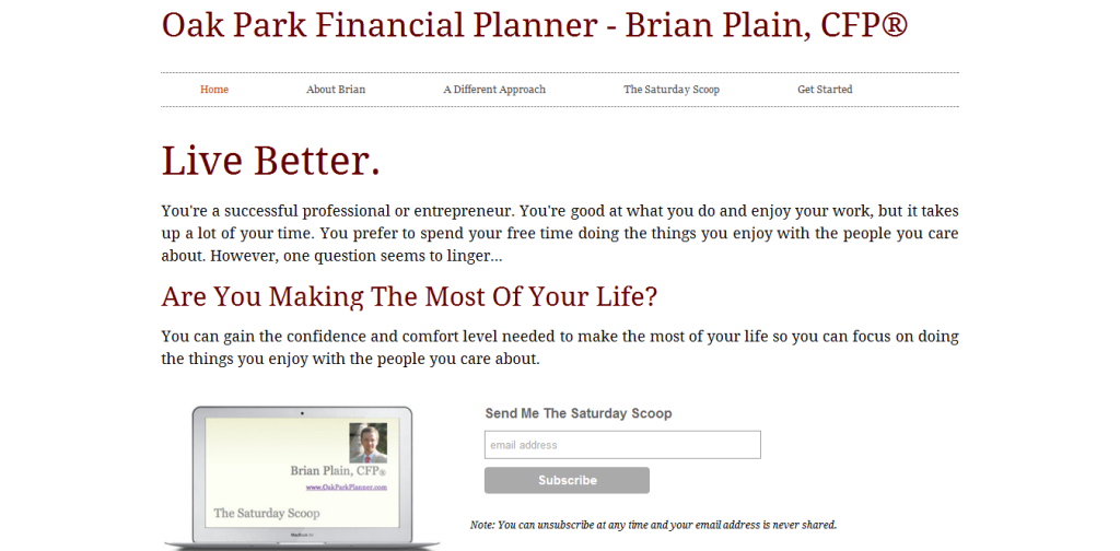
3. Oak Park Financial Planner
This website speaks to “you,” the potential client. Too few advisor websites do this. It also has a newsletter subscription box displayed prominently “above the fold,” which means the reader doesn’t have to scroll down to see it.
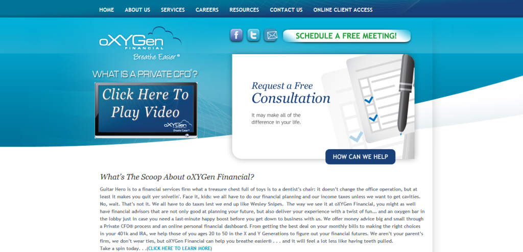
4. oXYGen Financial
The home page offers plenty of opportunities to click to become more engaged with the website or the firm.
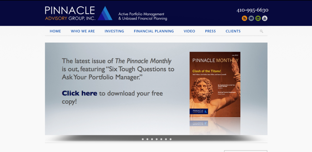
5. Pinnacle Advisory Group
The featured content on the home page is always changing, giving the reader a reason to return. The uncluttered home page features a striking image.
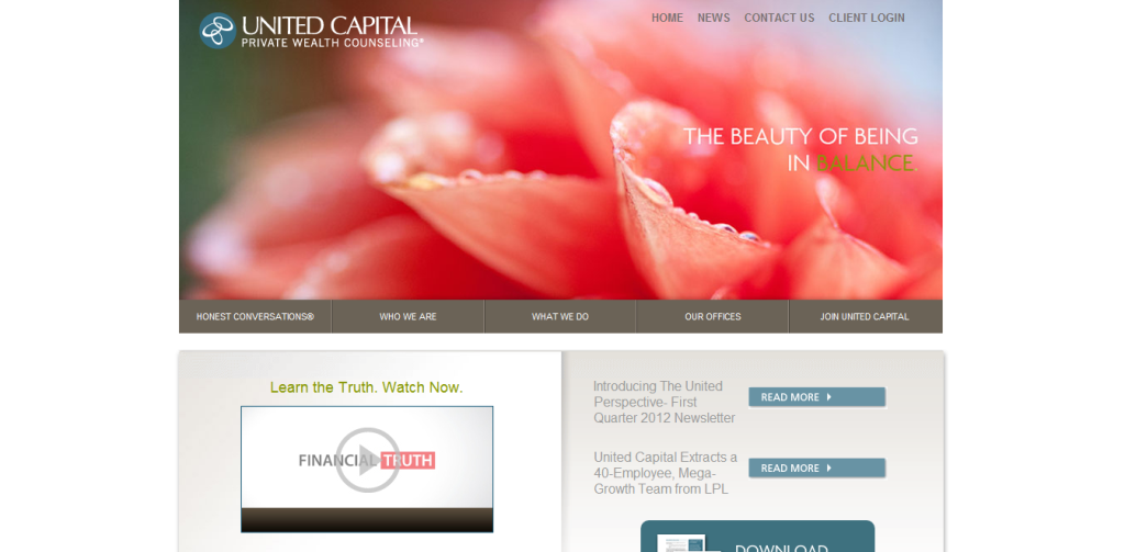
6. United Capital
The home page features a striking photograph along with video and print content to engage readers no matter how they prefer to consume content.
7. Wealthcare for Women
This website uses plain English. You feel that there’s a real person behind it.
What do YOU think?
I look forward to hearing from you.

