“10 Ways to optimize your e-newsletter landing page” is one tiny but useful section of Joe Pulizzi’s Epic Content Marketing. It’s important to craft  your landing page—the newsletter’s signup page—effectively because, as Pulizzi writes, “your email database is a significant business asset.” Your email list is valuable because you control it in a way you can’t control social media connections.
Here are some tips from Pulizzi that will help you attract more people to your e-newsletter list because you convey the benefits of your content and make your signup easy to navigate.
Tip 1. Describe newsletter benefits
Explain how your prospect will benefit from subscribing to your newsletter, as Pulizzi suggests. For example, say how it’ll help them achieve financial peace of mind or otherwise improve their lives.
The benefits needn’t be limited to how your newsletter articles help readers. You can also offer a special report as an enticement for readers. That’s what I do with Investment Writing Top Tips.
Sharing testimonials or awards for your newsletter, another Pulizzi tip, also reinforces your newsletter’s benefits for the reader.
Tip 2. Make your landing page layout effective
Make it easy for readers to find your signup form on the page. This is why it’s important to “bring the signup above the fold,” as Pulizzi suggests, so it is visible without the reader scrolling down the page. You can view my newsletter signup page for an example of positioning.
Pulizzi also suggests that your signup should “include a button that says ‘subscribe’ or ‘sign up’ (not submit),” taking advantage of words with positive connotations.
Put less important information farther down the page. This includes a privacy statement, which is still essential. Pulizzi also suggests that you tell subscribers “what you will and won’t do with their information. This can go bottom of your page,” says Pulizzi.
Another design tip is to rid your newsletter page of anything that might distract the reader from signing up, says Pulizzi.
Tip 3. Show readers what they’ll get
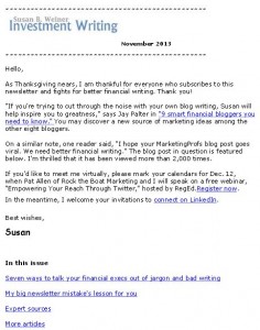
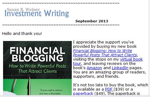
Pulizzi suggests that you show readers a picture of your newsletter. I think he means a small image of your newsletter’s first page (see example of my newsletter on the right) or maybe just a table of contents.
Also, link to a sample newsletter. Until recently, I’ve handled this by providing an archive of my monthly newsletters, instead of one sample that I’d need to update periodically.
Tip 4. Limit your newsletter sign-up form’s fields
Limit the number of fields in your newsletter sign-up form. As Pulizzi says, “ the fewer fields, the more likely prospects will be to sign up.”
When I started my newsletter I required only two fields, first name and email address. Now that I’m more confident of my newsletter’s appeal, I request, but don’t require, last names and company names.
Pulizzi’s book as a content marketing resource
If you’re new to content marketing, Epic Content Marketing offers a great overview of content marketing’s many components. It suggests steps that the reader can take to launch their content marketing strategy and manage their content process. There’s information for more experienced marketers too. I noticed some items for action, such as checking out the persona creation tool at upcloseandpersona.com. I’d also like to take a more analytical look at my content strategy.
As a writer, I noticed that some of the writing isn’t as tight as I’d like. For example, information that’s presented as a series of nine bullets screams for a rewrite. Too many bullet points exhaust the reader.
On balance, I enjoyed the book because it made me think.
Disclosures: I received a free copy of this book from McGraw Hill in return for agreeing to mention it in my blog. If you click on the Amazon link in this post and then buy something, I will receive a small commission. I only link to books in which I find some value for my blog’s readers.

