Tag Archive for: effective emails

What YOU say about highlighting text in emails

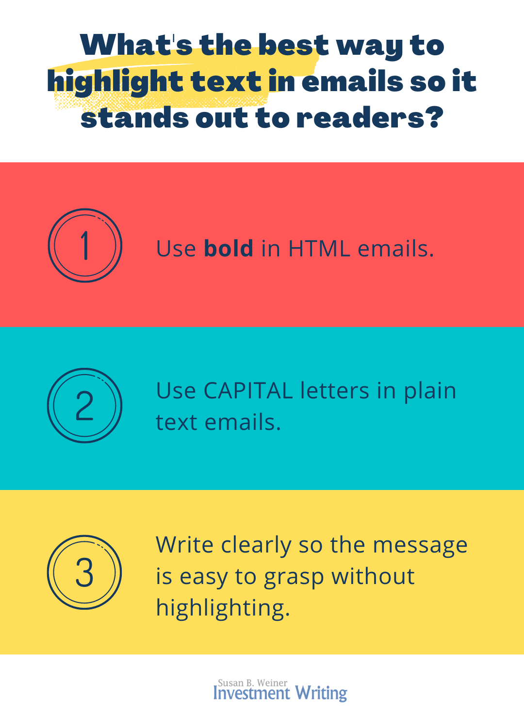
What’s the best way to highlight text in emails? That’s the question I posed in a poll. I took away three main lessons from your responses. Thank you very much, respondents, for answering and generously sharing your email tips!
How to highlight text in emails

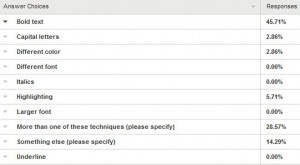
Lesson 1. Bold wins for highlightingPoll results for email highlighting

Use bold to emphasize text in your emails. That was by far the most popular answer to my poll asking, “What technique do you use for emphasizing text—for example, an appointment date—in an email?” This squares with my instinct to bold for emphasis, as in the example below:

May I call you on Mon., Feb. 16, at 2 p.m. Eastern?

However, with 45.71% selecting bold, it failed to win a majority. The next most popular answer, at 28.57%, was “More than one of these techniques.” I sometimes use bold plus larger font size or capital letters. You suggested other options, including some that are mainly useful in plain-text emails.

Lesson 2. Text-only email limits your highlighting options

Your poll responses provided a valuable reminder to me. Unlike me, some people force incoming emails into a plain-text format. This strips out fancy formatting—such as bold, italics, and colors—that relies on HTML code. People do this for reasons such as reducing the risk of computer viruses or cutting the email’s size once it’s stored on their computer.

Take note if you have an important correspondent who only reads emails in plain text. You’ll need to adapt your formatting for them.

How can you learn about your correspondent’s email-reading capabilities? If their emails to you look as if they were created on a typewriter, they’re plain text. Also, often when you reply to their emails, you’re not able to apply fancy formatting using HTML.

Some experts suggest that you send emails in both HTML and plain-text formats. But who has the time?

If you send plain-text emails, my poll respondents suggest using asterisks, underscores, or capital letters to highlight text. Here are some of their comments:

  • Unless I know for certain the recipient can read HTML e-mail I’ll use *asterisks* to set off the text. If the recipient is getting the mail in HTML.
  • Most of my email accounts don’t allow for [HTML]. The only thing I can do to bullet something important to place it between asterisks.

I particularly like the idea of using capital letters because they’ll seem less strange and old-fashioned if some of the readers of a group email use HTML.

Lesson 3. Remember other highlighting techniques

I agree with the respondent who said, “I think the more important point is to make sure writers are getting to the point quickly in their email messages. They need to keep the reader’s needs for information in mind and get every message off to a fast start.”

Your comments reminded me of other techniques for highlighting content in your emails, including

  • Strong subject lines, summaries at the top of your emails, and headings, an approach that I emphasize in my presentations on “Writing Effective Emails“—as one respondent said, “I place important information first in the subject line, then there’s no need to emphasize it in the email.”
  • White space to set off important information—as one respondent said, “I often isolate the information on its own line, surrounded by an empty line above and below (this is called using ‘white space’).” Indenting the information can be part of this technique.
  • Good writing techniques in general—as one respondent said, “It may be an old-fashioned notion these days, but I thought that formatting doesn’t always work in email, so I have always tried to use my writing to draw attention. I use very brief sentences, bullets, one line standing alone with a piece of important information, repeat major point again at the end – things like that. Some people use the email’s subject line, i.e., Deadline is tomorrow! I also adhere to the short and sweet method of writing, because people tend to read emails on their phone. So I’ll jump right to point – hey, my deadline is tomorrow.”

A funny HTML story

Here’s a reminder from a respondent that what you see in your email program isn’t always what appears on the recipient’s screen:

I use a Mac and one of my editors uses a PC. She kept putting what looked like little J’s after sentences in her mails to me. I finally asked what those were – turns out, that’s how her smiley emoticons were being interpreted by Mac Mail. (Not sure what she saw with my Mac smileys – I think something weird, too.) I know this isn’t about emphasizing text per se, but it does show some cross-platform problems still exist within email. 🙂

What will YOU do differently now when you write emails?

After reading your poll responses, I may use capital letters more often for emphasis since they appear the same in both HTML and plain-text emails. Is there something you’ll do differently after reading my poll results?


Note: This post was updated on Oct. 31, 2022, to reflect the fact that Constant Contact no longer automatically generates plain text versions of your newsletters.

Out-of-office auto-reply: vacation necessity?

It’s summertime. Vacations abound, so you’d think that out-of-office auto-reply emails would be just as numerous. Think again. It seems as if they’re on the decline, just like the length of time that we see the sun now that we’ve passed the summer solstice. That’s frustrating for people like me. We could adjust our plans if the vacationers let us know that they’re away. Instead, we’re in limbo.

I’m not alone in my perception that out-of-office messages are less common. My LinkedIn status update on this topic attracted many likes and people saying that they’ve noticed this phenomenon. It also scored more than 2,500 views, which is huge for me.

What’s behind the out-of-office auto-reply’s decline?

I blame the decline of out-of-office messages on the rise of the smartphone. Now that people carry their email everywhere, they think they’ll reply from vacation. They may not plan to reply to every email, but at least to important ones. However, desire seems to collide with vacation-induced inertia—or the judgment that emails like mine aren’t important.

The smartphone may not be the only culprit. One respondent to my LinkedIn update said that some people lack the ability to set up auto-reply messages. Financial technology expert Blane Warrene says,

If someone is anchored to mobile only, it can be tricky handling out-of-office messages. Some accounts do not allow for the Automatic Replies feature in Outlook on mobile, for example, when they are not powered by an Exchange server. A little how-to prep can fix this, though. Even simple POP and IMAP accounts (for example, if you have a GoDaddy domain that also anchors your email accounts in a small business) offer web access to the setting that enables out-of-office responses.

In general, though, most mobile apps do allow for setting up mobile out-of-office settings. This includes iCloud, Gmail (free and professional), as well as the aforementioned browser access.

If this discussion of servers and domains confuses you, you’re not alone. There are people who struggle to follow instructions to set up auto-reply messages. I have one friend who relies on a helper to set up auto-reply messages. Some people may avoid setting up auto-replies because they don’t know how to create them.

Another potential culprit: the explosion of spam. Graphic designer Karen Coleman said in response to my LinkedIn update, “I don’t like auto-responders going from my email account. I don’t want it going to spam bots so they know the email is active.” She’s afraid she would receive even more junk emails if she used auto-reply messages.

Self-employed people are especially likely to worry that an out-of-office message alerts thieves to their absence. No one wants to advertise, “Hey, come break in!”

When do you need an out-of-office auto-reply strategy?

I don’t believe that you need to turn on your out-of-office message when you’re out of the office for only one day. But if you’re out for an entire week, it’s polite—and good for business—to let people know that you won’t be reading or responding to email.

Warrene agrees, saying, “I have found through years of both corporate work and starting and operating businesses, that the out-of-office message is woefully underused.”

Put some thought into your message. Sue Hershkowitz-Coore, author of Power Sales Writing, says:

With the expectation of an immediate reply, an out-of-office auto-reply can be quite helpful. The challenge is the message needs to be more than “Thanks for your message, I’m not here.” Beyond explaining when to expect a reply and an alternate contact, if available, it must also be on-brand. This is key to engagement.

A good out-of-office message will improve the quality of your time away from your email. Warrene says, “The out-of-office message can be used artfully (with well written and useful directions for correspondents) so blocked time can be used efficiently when on the road for business or pleasure.”

If you can’t or won’t respond to email from vacation, then set up a workaround. For example, you could ask a colleague to monitor your email. If you’re a solopreneur, you hire a virtual assistant to check email for you, as Coleman suggested in her LinkedIn reply to me. This gets around the concern that an out-of-office message will alert thieves that their homes are ready to be robbed.


Writing an email help request that gets results

“I NEED HELP!” This line will get your email recipient’s attention. But email help requests that sound this desperate won’t get the results you seek. Nor will requests that are too subtle. Strike a balance to achieve the best results.

Let me illustrate what works—and what doesn’t—with a before-and-after example of a financial professional’s email request for help. Imagine that you’re a financial blogger asking respected experts to contribute to an article, and you need their responses by a specific date. How would you tackle it? The writer of “Email help request 1” makes mistakes.

Email help request 1

Here’s “Email help request 1”

Re: article on my blog

Hi Charlie,

I am writing the latest article for my blog, which I update weekly. I think it would be great if you could contribute something to my blog. My readers are interested in saving for retirement and you write a lot of articles about retirement. Your good name could help me get better known in this space. Could you send me your opinions on what works in terms of rolling over a traditional IRA into a Roth IRA? It would be great if you could reply by the second week in March.

Compared with “Email help request 1,” the author of the next email writes in a way that’s easier for the recipient to understand.

Email help request 2

Re: Answer Roth IRA question by March 6?

Hi Charlie,

Our mutual friend, Janet Brown suggested, I contact you because she thinks you would be a great expert to contribute to my blog. Also, she experienced a boost in her e-newsletter subscribers after contributing to my blog last month.

By Tuesday, March 7, could you briefly answer my question about Roth IRAs, so I can incorporate your answer into a blog post? Here’s my question: How does an individual’s number of years until expected retirement affect the attractiveness of rolling a traditional IRA into a Roth IRA? After I compile my blog post, I will check to make sure that I’ve presented your views accurately.

My blog receives 5,000 views monthly, and my target audience of dog-owners in their 50s and 60s for my financial planning business seems to overlap with your target as a consultant. I’d be happy to link to your website and feature your photo in my blog.

Please let me know if you have any questions. I’ll call you next week if I don’t hear from you.

What makes an email help request effective?

I believe the second email request will be more effective than the first.

Why will the second email work better?

  1. The subject line clearly identifies the reason for the email.
  2. The first paragraph establishes a relationship between the writer and the recipient, by referring to their mutual friend.
  3. The second paragraph says exactly what the writer is seeking, including the deadline for a reply.
  4. The third paragraph (and the end of the first paragraph) suggests how the recipient may benefit from responding to the writer’s request. This contrasts with the first email that is mostly about the sender
  5. Breaking the email into paragraphs makes it easier for the recipient to absorb the information.
  6. The promise—threat?—of a follow-up may spur the recipient to reply, even if it’s just to say “No, thanks.”

The first email is too self-centered and makes the reader work too hard to figure out what the writer wants.


If you enjoyed this post, you may also enjoy “Top four email mistakes to avoid when you have a referral.”

Image courtesy of Keerati at FreeDigitalPhotos.net.

Financial e-newsletters, kill your annoying, weak clickbait!

Some financial e-newsletters drive me crazy. I click to open them and find nothing there. Well, not nothing, but just enough to annoy the heck out of me.

If you’re doing what these newsletters do, please stop.

The most annoying habit of financial e-newsletters that I actually open

If I actually open a financial e-newsletter, I expect it to have some content. The body of the newsletter shouldn’t simply consists of links leading elsewhere.

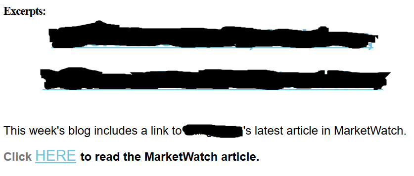
Below is an example of a newsletter that failed the test. The first two blacked-out lines are the title of a blog post formatted as a clickable link. I’m concealing the firm’s identity because I assume this is an innocent mistake on their part. It’s the kind of thing that happens when non-professional writers create content.

annoying financial e-newsletters: an example

This is the only text that appeared in the main body of a financial e-newsletter that I received.


I think that the e-newsletter senders hoped that their links would serve as clickbait—provocative content that drives readers to a web page. However, the title of a blog post written by financial professional rarely has the flair to do that.

The senders could have achieved better results by adding a brief summary or introduction to their article on MarketWatch. That would have let me assess whether their topic interested me.

I understand that the authors probably are limited in how much they can copy from their MarketWatch article. However, that shouldn’t prevent them from writing teaser copy or saying “If you’re a ___ type of investor, this article can help you to ____.”

The second offense by this financial e-newsletter

clickbaitWhen I clicked on the two blacked-out lines, which are clearly meant to be clickable links, they took me to a post on the company’s blog. The content on the page? Exactly what you see in the image above.
Oops! I had to click again to reach the article on MarketWatch. What casual reader is going to take all of these steps with so little indication in the e-newsletter of what benefit they’ll gain from their clicks?

I understand that people want to drive traffic to their websites. But balance that against the risk that along the way you’ll annoy and lose readers for your financial e-newsletters.

I think the newsletter senders in this case should have linked directly to their post on MarketWatch. They would have avoided annoying me by sending me to their blog post that didn’t add anything new. Also, even without the link to their website, they would have learned whether their title was strong enough to interest me. Most newsletter programs allow you to measure your readers’ click. Although their measurements aren’t 100 percent accurate, they’ll tell you if one title attracts more readers than another.

Mistakes by other financial e-newsletters

What else do financial e-newsletters do to annoy or drive away readers? They:

  1. Add people to their newsletter distribution lists without asking permission, as I’ve discussed in “no, No, NO: My business card shouldn’t add me to your e-newsletter list” and “Our LinkedIn connection isn’t an invitation to spam.”
  2. Use weak subject lines in their emails. For an analysis of a weak title and how to spice it up, read “Stop! Get a better title, or forget winning readers.”
  3. Send newsletters that aren’t mobile-friendly. Today people are often read emails on their phones and other mobile devices that fail to display traditional e-newsletter formats effectively. For tips on how to be mobile-friendly, see “3 ways to make your emails mobile-friendly.”

They may also suffer from “4 reasons your emails don’t get results.”

Image courtesy of adamr/FreeDigitalPhotos.net

3 ways to make your emails mobile-friendly

Mobile-friendly emails are essential. Your clients, prospects, referral sources, and colleagues are increasingly reading emails on their mobile devices. If they don’t like what they see, they may delete or ignore your messages.

Here’s an interesting statistic from a webinar on “Demystifying Brand Journalism,” sponsored by the American Society of Business Press Editors:

80% of people delete an email if it doesn’t look good on their device.

I’m not a mobile guru, but I’ve noticed three things that encourage me to read emails on my phone.

Technique 1: Short subject lines that get to the point

No matter where your recipients read your emails, you’ll benefit from short subject lines that get to the point quickly. Your first two words are key, as I’ve said in “Improve your email subject-line vocabulary with The Hamster Revolution.”

“Short and sweet” is even more important on mobile devices, which may show as few as 15 characters of your subject line vs. 40+ characters on a traditional computer. Wearable devices could make things even tougher, as explained in “What effect could wearables have on email marketing?” by Wynn Zhou on memeburn.

Technique 2: Use mobile-friendly formatting

Traditional emails, especially multi-column e-newsletters, may be too wide to display well on mobile device. Below is an example of an image that’s too big to be mobile-friendly.

I believe that traditional text-only emails will fit well on your mobile device, although you should still do your best to make your email short and easily skimmed.

If you’ve been producing an e-newsletter for a long time, check to see if you can switch to a mobile-friendly or mobile-responsive format. I made the change earlier this year, using a template provided by Constant Contact.

Technique 3: Avoid attachments

Attachments and mobile devices don’t play well together. Attachments are a pain to download and even more of a pain to read on a tiny screen.

Want to share information beyond what’s in your email? Use a link to a mobile-friendly webpage.

YOUR suggestions?

What works to entice you to read emails on your phone? Much of what works on mobile devices also works on traditional computers.

Please share your insights. I enjoy learning from you.

Improve your email subject-line vocabulary with “The Hamster Revolution”

Boosting the power of your email subject lines is the best way for most people to boost the effectiveness of their emails. It’s a focus of my email presentations.

In this post, I share subject-line tips from The Hamster Revolution: Stop Info-Glut—Reclaim Your Life! by Mike Song, Vicki Halsey, and Tim Burress. Some of their suggestions may be most useful to team members who email each other frequently.

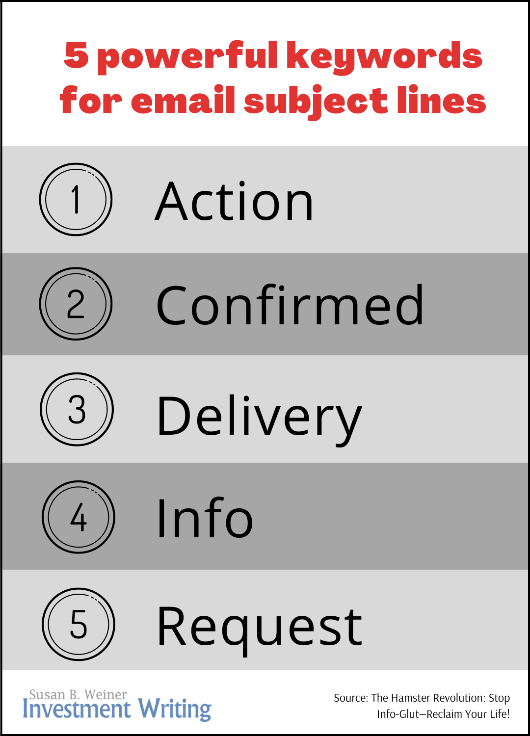
5 powerful keywords for email subject lines inforgraphic


Start email subject lines with these keywords

The Hamster Revolution suggests starting your email subject lines with words that define their category. “These categories build context and rapid comprehension for your reader,” say the authors.

Here are the category words recommended by the authors:

  1. Action
  2. Confirmed
  3. Delivery
  4. Info
  5. Request

1. Action and 5. Request

The authors don’t say when to use “Action” instead of “Request.” I see the two as overlapping. Either word could start a subject line saying “help George to prepare plan.” In my opinion, you can drop “Action” in favor of “Request,” which is #5 on their list.

2. Confirmed

“Confirmed” can precede the details of an appointment or agreement. For example, “Confirmed: Oct. 15, 3 p.m. meeting.”

3. Delivery

The meaning of “delivery” in an email subject line isn’t immediately clear. For this reason, it’s most appropriate for use with members of your team after you train them in its meaning.

Here’s how Hamster Revolution defines it:

Delivery is used when you’re responding to a specific request. It’s your way of saying “I’m delivering exactly what you requested.”

4. Info

To me, “Info” signals that an email simply provides information; it doesn’t require a reply. If I’m waiting for that information, I quickly realize that the sender has satisfied my needs. On the other hand, I may be able to file the email without reading it. That’s a time-saver.

I’m more likely to use FYI than “Info,” but either is fine.

Handy abbreviations

Abbreviations can help teams to communicate more efficiently. When I led an investment communications tea m at an investment management firm, we used “EOM.” As I discussed in “Fit it in your subject line EOM,” EOM appears at the end of the subject line and is short for “end of message.” It means that there’s no need to open the email because the entire message appears in the subject line.

The Hamster Revolution suggests two more subject line abbreviations:

  • NRN for “no reply needed”
  • NTN for “no thanks needed”

I can imagine both abbreviations saving time for teams. However, NTN could seem a bit obnoxious, as if you’re saying “You really ought to thank me, but I’ll let you get away without doing it.”

Best for team emails

These subject line tips will be most powerful when used with your team members, especially after you’ve trained them on their use.

When communicating with clients, you may prefer to skip category words in favor of other powerful words. For example, if clients are waiting for information on the XYZ Fund, the subject line “XYZ Fund info” more efficiently conveys your message than “Info: XYZ Fund.” This is because readers focus more on the first words of your email subject lines.

Stay away from abbreviations such as EOM and NRN with clients, unless you know they understand them. You’ll confuse them.

Disclosure: If you click on the Amazon link in this post and then buy something, I will receive a small commission. I only link to books in which I find some value for my blog’s readers.

How to highlight text in emails

When you write emails, plain text sometimes isn’t enough. You want to visually emphasize one piece of information, such as the proposed date and time of your phone call with the recipient. While I discuss options below, I’m interested in your ideas. Please answer my poll on this topic. I’ll report on the results in a future issue of my e-newsletter.

Text choices

Let’s examine some options for tackling your challenge in the sentence “May I call you on Mon., Feb. 16, at 2 p.m. Eastern?”

  1. Use bold

May I call you on Mon., Feb. 16, at 2 p.m. Eastern?

  1. Underline

May I call you on Mon., Feb. 16, at 2 p.m. Eastern?

  1. Change font color

May I call you on Mon., Feb. 16, at 2 p.m. Eastern?

  1. Use highlighting

    Highlighting in yellow seems a little too showy to me.

    By the way, the text in the example below (and in number 5)  is extra-large because it’s a screenshot. I couldn’t figure out how to produce my example directly in WordPress.

Email_sample_with_yellow_highlighting


  1. Combine multiple techniques

    I like bold, but I feel as if my email program’s bold doesn’t stand out enough. I often increase the font size of my bolded text, as in the example below. 

    You can try your own combinations. I suggest that you avoid two techniques that are associated with hyperlinks: underlining and blue text.

Email_sample_with_bold_and_big_font

Plain-text email limitations

Your options are limited if you must use plain-text emails. However, you can capitalize the text that you want to emphasize:

May I call you on MON., FEB. 16, at 2 p.m. Eastern?

Bonus tips

Changing your fonts isn’t only for emphasizing a specific piece of information. You can also put the key information in your subject line, as in “2 p.m. call on Mon., Feb. 16?” If confirming that time is your email’s main goal, then repeat this in your email’s first sentence. Repeat the information in a heading, if you cover multiple topics in your email. For example, one heading could be “2 p.m. call on Mon., Feb. 16?” and the other one might be “401(k) plan next steps.”

What do YOU think?

Please take my poll on this topic. I’d like to learn about the techniques that you use. I’m also interested in what techniques annoy you. For example, one of my friends says she doesn’t like multiple font sizes because it throws off the alignment of the email’s lines.

Polls like this can influence my email practices. Before I ran the poll in “To ‘dear’ or not to ‘dear’ in your email,” I always started my emails with the recipient’s name, followed by a comma. My poll made me realize that starting emails with “Hi” and then the recipient’s name and a comma is widespread. While I still prefer the simplicity of “Susan,” now I try to notice other people’s preference for “Hi.” I reciprocate whenever I’m aware of their preference.

If you’d like to write better emails

I’m available to give presentations and workshops on “Writing Effective Emails.” I’ve spoken on this topic to the Financial Planning Association’s FPA Experience conference, FPA chapters, and corporate clients.

Email subject lines: How to handle boring disclosures

What subject line should you use when you send clients a disclosure via email? This question came up came up when I spoke to the Financial Planning Association of Massachusetts in 2013.

The problem: Losing your clients’ attention

You send some emails because you need to move clients to action. Others, such as disclosures required by regulators, are less compelling.Choose your subject lines carefully, if you don’t want these emails to discourage your clients from reading your emails.

Here’s a list of disclosures that advisors told me might be sent via email:

  • Client agreement
  • Fee disclosure
  • Form ADV, Part 2
  • ERISA-related disclosure, such as a Rule 408(b)(2) disclosure
  • Privacy policy

Sure, it’s important for clients to understand the legal nature of your relationship. However, most of them won’t read boilerplate disclosures. Even worse, when they receive one boring email from you, they become less likely to open your future emails.

Solutions: Label clearly or bundle

The worst thing you can do is to send the disclosure with a vague or misleading subject line—something like “update from XYZ Advisors.”

Instead, label the email clearly, making it easy for your clients to decide whether to open it. You could write something like “annual disclosure of _____,” dropping the key topic in my blank.

Another possibility is to avoid sending the disclosure as a standalone email, assuming that’s okay with your compliance experts. For example, you could include the disclosure with your quarterly client email or monthly client e-newsletter.

YOUR solution?

I’m curious to learn how you handle this challenge. Please comment.

Financial advisor email tip: Fit it in your subject line EOM

Your email recipients are busy, so they’ll thank you for saving them time by summarizing your message in your subject line.

It could be something like “Need to meet; pls reply by Friday” or “4 ways to save on taxes.”

Informative subject lines let your readers quickly assess whether they should open your email. They can even create a sense of urgency in those readers when you include deadlines or potential benefits to the readers.

If you regularly exchange messages that can be communicated completely in the subject line, consider using EOM at the end of such subject lines with people who know what EOM means. EOM stands for “end of message.” It means that your message is contained in your subject line, so there’s no need to click to read more. If recipients open the email, they’ll find it’s empty. For example, a message might consist solely of “Confirming 4 p.m. meeting at your office today EOM.”

However, EOM will confuse people who haven’t learned about it. That’s why I used EOM only in messages to my employees when I ran an asset management firm’s investment communications group. You may also find it helpful for your firm’s internal communications. Today I use EOM with my husband because both of us like saving the time it takes to click open an email.

I’d like to thank the participants in my Accelus Partners’ Expert Series Interview about email on June 25. Our Q&A session prompted this blog post.

One topic per email, please

Limiting every email to one topic is the best way to ensure your message gets across.

I’ve concluded this after some failed experiments in highlighting multiple topics. I list and number topics in my email subject lines. For example, 1) White paper draft; 2) invoice. This works most of the time, but not always. Some of my invoices have been paid late as a result.

Perhaps this technique would work better if I also listed both topics at the top of the email’s body. For example, I could start with the following:

Attached you’ll find:

  1. The draft of your white paper
  2. Your invoice

Alternatively, I could have discussed each topic under a separate heading. At a minimum, I needed to mention both topics in the body of emails instead of relying on the subject line to do all of my work.

Your solution for multi-topic emails?

I’d like to learn how you handle multi-topic emails. Please share.