Improve your design skills with this book
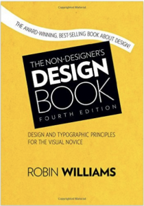
Want to improve your design skills? Would you like to be able to look at something and have ideas about how to tweak its design? The Non-Designer’s Design Book: Design and Typographic Principles for the Visual Novice can help.
4 principles to improve your design skills
I like how author Robin Williams tackles the four main principles:
- Contrast
- Repetition
- Alignment
- Proximity
She doesn’t just explain them verbally. She provides before-and-after examples, dissecting different designs. Even better, she challenges you to critique in “Train your Designer Eye” examples. After you jot down your ideas about a specific item, you can flip to her suggestions in the back of the book. These exercises mean you’re more likely to improve your design skills than if you simply read passively.
Centered alignment: good or bad?
Williams challenged my tendency to center titles and similar text. She says, “I guarantee most designs that have a sophisticated look are not centered.” She does, however, say that centered designs are more formal.
I’m mulling over what I think about this. Her comment has me looking more critically at design elements such as centering. I like it when my reading challenges my thinking.
Disclosure: If you click on an Amazon link in this post and then buy something, I will receive a small commission. I link only to books in which I find some value for my blog’s readers.


