Webinar lessons from my annual webinars

Mastering the technology for my first webinar in 2014 was hell, as I have shared in “Tech tips for your educational webinar—learn from my experience.” Things have gotten easier since then, especially because I’ve stuck with GoToWebinar, but things can still go wrong. If you’re an infrequent webinar presenter like me, you can learn from my experience presenting my annual investment commentary webinar.

Lesson 1. Stick with the same software

There may be webinar software that’s better or cheaper than GoToWebinar. But over four years of annual webinars, I’ve learned how to manage its basics. Also, the branding and some other settings that I’ve established in past years carry over from year to year. That saves me time.

You may think that all webinar software functions basically the same. My 2014 experience shifting to GoToWebinar from an awful low-cost provider suggests that’s not true. However, I only have experience with two providers.

Lesson 2. Plan to practice early and often

Things will go wrong with your webinar software. At least, that’s true in my experience. So run practice sessions—including sessions with simulated viewers (and co-organizers, if relevant).

In my experience, moving the cursor is often a source of problems. So, manipulate it a lot. Sabotage yourself, and then practice recovering. Then, if something goes wrong in your live presentation, you’ll recover more rapidly.

By the way, if you’re only moving from slide to slide, you may be able to skip moving your cursor because you can advance slides using an arrow key. However, this means you’re not using tools like polls or highlighters. Nor are you reviewing and managing participant questions or comments. By not using those tools, you lose opportunities to engage your audience. That may hurt the effectiveness of your webinar.

If you uncover problems early enough, you can work with the webinar provider to find a solution that minimizes them. Through multiple exchanges—on the telephone and in the online support community—this year I found a less trouble-prone way to advance my slides.

Lesson 3. Be aware that software may change from year to year

Software changes. There may be “improvements” or the software may change to accommodate new operating systems, like Windows 10.

For example, I believe that, back in 2014, the lines that I drew using GoToWebinar’s drawing tool disappeared when I clicked to the next page. That was convenient. But now I have to erase those lines. That’s an extra step that slows me down so I’ve stopped using the drawing tool.

In short, you assume at your own risk that what works one year will work again the next year.

Lesson 4. The experience of your helpers matters

I’m lucky to have worked with some wonderful helpers on my webinars. One of my helpers had lots more experience in webinar presentations and technology than the others. Her experience made my experience more relaxing.

I highly recommend using helpers to manage your introduction, Q&A, and behind-the-scenes logistics. They’ll improve the experience for you and your audience. However, if you’re a worrywart like me, you’ll also do some practice sessions in which you play all of the roles. In a pinch, I could have introduced myself, launched my polls, and handled technical problems and Q&A on my own. Sure, I would have felt like an anxious mess. But I could have blundered my way through the presentation.

Consider these lessons to give yourself and your audience a better webinar experience.

Image courtesy of Stuart Miles at FreeDigitalPhotos.net.

May 2013 presentations: Boost the effectiveness of your writing

Susan Weiner, ProfNet, #ConnectChat

If you’d like to boost the effectiveness of your financial writing, consider attending one of my May 2013 events in Hartford, Conn., New York City, or Norwood, Mass.

“How to Write Investment Commentary People Will Read” in Hartford, Conn., and New York City

  •  I will speak to the CFA Society Hartford on May 2. This is a classic presentation that I’ve delivered to CFA societies across the U.S. and Canada. The lunch meeting runs from 12 noon to 1:30 p.m. at the Hartford Club. Please register in advance.


“Writing Emails and Letters People Will Read”

On May 16 I’ll present “Writing Emails and Letters People Will Read” to the Financial Planning Association of Massachusetts. It’s part of the association’s all-day annual meeting. You can register online for this event.

“The Four Secrets of Must-Read Communications”

I’ll present “The Four Secrets of Must-Read Communications,” an interactive program on investment-related communications at the PAICR RFP Symposium in New York City on May 20.  

Mistake Monday

To improve your proofreading skills, be sure to “like” the Investment Writing Facebook page and visit on Mistake Mondays. It’ll raise your awareness of common mistakes that we all make. You’ll also find links focusing on blogging, writing, and marketing.

Yes, that’s really my photo on a Times Square billboard

At 3 p.m. on March 5, I was the featured guest on ProfNet’s #ConnectChat Twitter chat moderated by Maria Perez (@ProfNet). I tweeted for journalists who’d like to shift into corporate writing. One cool thing was that my picture was posted in the Reuters billboard in Times Square as part of the chat promotion (see photo above). My recent Twitter chat for journalists trying to break into the corporate market was summarized on the ProfNet blog.

Please, no tiny fonts on your PowerPoint slides

You don’t want to make your audience strain their eyes, so make the text on your slides sample slidebig enough.

Savvy friends have told me to go no smaller than 28 points in my PowerPoint slide text. This squares with what Nancy Duarte says in slide:ology:

For keynotes, don’t go smaller than 28 pt. If you are consistently reducing your point size to under 24 pt and using third-level bullets, you have officially created a document and not a slide.

The Financial Planning Association has similar standards, as I learned preparing for FPA Experience.

Slide:ology presents a handy tip for your slides’ visibility: “Put your file into slide sorter view. Look at the slides at 66 percent size. If you can still read them, so can your audience” (p 152). Of course, if you have unusual eyesight, like a former employee who said she had “fighter pilot eyes,” with vision better than 20/20, you may need to adjust accordingly. 

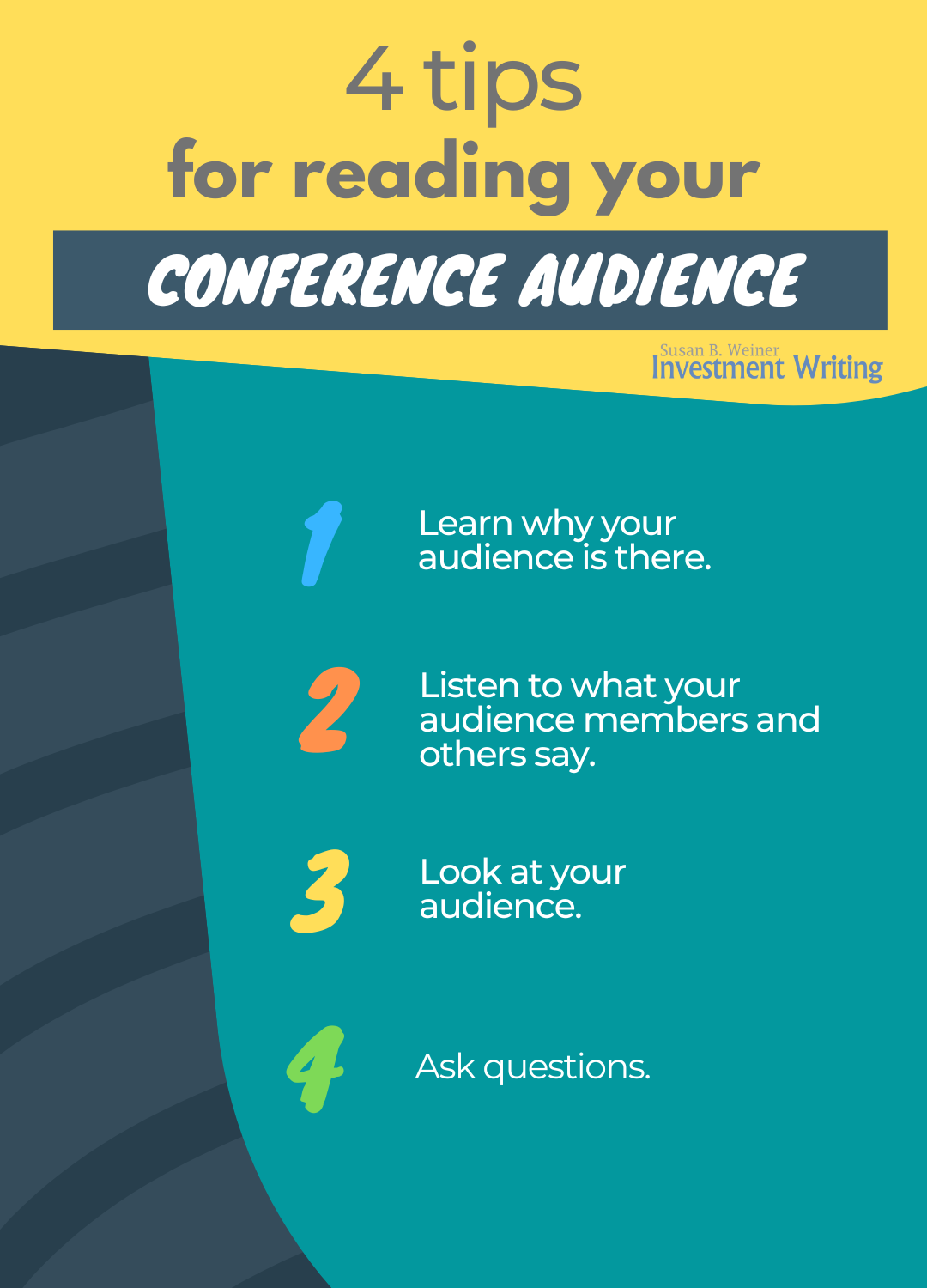
4 tips for reading your audience at conferences

When I prepared to speak at a Financial Planning Association national conference, the following quote caught my eye:

You don’t have good or bad audiences. You have audiences you read or you fail to read.

-Richard Hall, Brilliant presentations:
What the best presenters know, say and do

This made me think about how to read an audience.

4 tips for reading your conference audience infographic

1. Learn why your audience is there

Once you understand your audience, you can appeal to their hopes, fears, and dreams. I stress this in my writing advice, too.

When I’ve spoken to FPA audiences on “Writing Emails and Letters that People Will Read” people will be there partly for the CE credit, but also, more importantly, so they can connect better with clients and others.

Borrow a technique from me: Ask your audiences to fill out a brief survey before they attend your talk. Of course, this is most effective if participants must register and provide their contact information well in advance of your presentation.

On the other hand, today there are apps that let you poll a live in-person audience. Those polls, with results projected on-screen also help to keep your audience engaged.

2. Listen

Listen to members of your audience and what people tell you about your audience, including any sensitivities. Ignore this information, and you may offend. You’ll certainly fail to make the best possible impression.

You should also listen to what people say during your live presentation. During webinars, I often have a colleague monitor the chat for me.

3. Look

Look at your audience. Make eye contact. Assess what seems to resonate and what falls flat.

4. Ask questions

I’m a big fan of interactive presentations. When people participate, especially when they apply the information you present, they learn more. This also raises the positive energy in the room.

I have had great experiences with asking members of in-person presentations to break into groups of two or three to do an exercise to apply the lessons I’m teaching them. The level of the participants’ buzz helps me to understand how engaged they are.


Note: I updated this post in December 2022.

Guest post: “Boost Chart Impact with Interpretation”

Marketing communications consultant Susan Becker and I met through LinkedIn. I’ve enjoyed many exchanges with her about how to communicate more effectively. Her guest post focuses on making the most of charts.

Boost Chart Impact with Interpretation
By Susan K. Becker

Because most people digest information visually rather than verbally, we are urged to stop relying on bullet points and, instead, to present information visually. For financial writers, this often means presenting  complex data in charts.

Unfortunately, in communicating visually, we often tend to sacrifice the verbal interpretation necessary to make the data easily understood. This post discusses two techniques to remedy the misleading assumption that “the numbers speak for themselves.” They result in charts that engage your audience and advance the story revealed in your data.

These techniques are:

  1. Interpretive titles that communicate the overall point of each chart, instead of just labeling what is shown (e.g., quarterly returns)
  2. Labels and call-outs that bring attention to what the reader should take away

I should point out that this post discusses investment writing using text with charts. We should design for the medium, so the suggestions here would be modified for a slide presentation that is projected or web-based.

1. Use interpretive titles

Marketwatch interactive charts offer abundant choices for presenting data. The chart below compares a stock’s 12-month stock performance against the SPX and DJIA.

The chart needs an interpretive title explaining its overall point, instead of a label like “12-month Performance.” A good question is, “What is its overall point?” The chart tells several stories: e.g., “Stock performance increasingly lagged the indexes, as the year went on”; or, “Stock performance declined sharply in August and ended the year at the same level.”

Use the interpretive title that furthers your message. For example, if your story focuses on ROI, you would want a title explaining “Stock X’s performance turned negative in March and continued to diverge from the indexes, ending the  year deep under water.”

2. Use interpretive labels and call-outs

Verbally signaling key data is another useful technique for the text-and-charts format, which accommodates more visual elements than slides projected during a presentation. The chart below tells the story of a web industry segment’s roughly one-year wild ride, 3Q99 through 4Q00, in a simple line chart made eloquent by interpretive notes.

If you have less white space, overlay the text in call-outs (click “Shapes” in Word and PowerPoint).

Susan K. Becker provides consulting and coaching in marketing communication and presentations at Manhattan-based Becker Consulting Services. View her work at http://www.slideshare.net/SusanKBecker and follow her on Twitter @SKBeckerCoach.

Make your webinar a magnet for audience participation

If you’re planning your first webinar, don’t forget to plan for audience participation. People who participate learn more and will give you better evaluations. I first

Photo: Mario's Planet

learned this when I developed and led custom workshops on “How to Do Business with the Japanese” back in the 1980s. My financial writing workshops have only reinforced this lesson. In this post, I’ll share some practical tips I learned preparing for my first webinar.

1. Ask up front for participation

People won’t make comments or ask questions if you don’t encourage them. Tell people at the beginning of your presentation that you’d like them to participate.

2. Tell your audience where and how to pose questions

It may not be obvious to your audience where they can type in their questions. Tell them where to go. You might even point to it in one of your slides.

3. Ask them questions

Prepare questions to ask your audience early on. This will get them involved. Plus, it will give you a sense of how they’re responding to your material.

You have options.

  • Polls are easy for your audience to answer.
  • Yes-no questions require only a little typing.
  • More complex questions can also work.

4. Don’t expect instantaneous responses by your audience

It takes time for people to input their responses, even when they simply click a button to answer your poll. Don’t get caught off guard by this. Instead, plan some patter to fill the time as you wait.

5. Encourage participation by responding

If you ask for participation, but fail to acknowledge audience participation, your audience will stop responding. Plan to integrate audience responses into your presentation. Answer their questions and mention at least some of their responses to questions you pose. I took this one step further by basing a blog post on some of the responses I received to a question I posed in a webinar.

6. Have a colleague help you

You may find it overwhelming to sort through your audience’s input. So, don’t go it alone. Ask a colleague to view the audience’s questions or answers and feed them to you. I found this very helpful in reducing my stress while I was presenting.

Can YOU add suggestions?

If you can add suggestions for attracting audience participation, please do. I look forward to hearing from you.

How I managed my presentation-writing anxiety

I freak out every time I have to write a new presentation. Well, not literally, but my anxiety does run wild. However, I managed to tame my most recent jitters with an exercise from life coach Cheryl Richardson.

Photo: Joe’s-photos

In “Break the Spell,” Richardson says,

“The minute you start worrying about something, stop and congratulate yourself for being so present and aware. Then, put pen to paper and list at least five positive outcomes you’d most like to have happen. Keep repeating these present-focused, positive statements throughout the day and notice how the energy starts to shift.”

Here are my five positive outcomes:

  1. The presentation is well-organized.
  2. Each member of the audience learns something that helps them write better.
  3. I come up with new ways of explaining things to people.
  4. My email list expands.
  5. My presentation helps me land new clients.

This exercise calmed my nerves enough that I could focus on writing my presentation. I hope it helps you, too.

If YOU have a good way to control presentation-related anxiety, I’d love to learn your tips.

Image courtesy of Stuart Miles at freedigitalphotos.net.

For RIAs: Is this good marketing? Better practice for fiduciaries?

Registered investment advisors, how much should you disclose when you use articles written by others? Is it okay to slap your name on articles largely written by others? What if those articles may also appear under the names of other advisors?

Below is a question posed by one of my readers.

Several DFA staff members write commentaries which are kept in a “library” for the approved advisors to use. Approved advisors can search for a commentary that they feel is timely (not usual to see commentaries which were written by DFA in 2008-2010 used in the present by an RIA).

A simple search of an DFA used commentary by an RIA will bring up multiple “DFA-approved RIAs.” However, in the individual RIA commentaries a few will use a disclaimer that states the subject matter was “Adapted From Joe Smith of Dimensional Fund Advisors” while many others will treat the commentary as their own work.

RIAs are quick to market their role as a fiduciary to their clients but I feel that acting with integrity is just as critical. I believe that citing sources correctly is fundamental to acting with integrity when communicating with clients and the public.

Do you think that clients would appreciate such disclosure and conversely disapprove of portraying another firms thoughts and research as originally from an RIA?

This isn’t–or shouldn’t be–an issue for registered representatives because FINRA advises them to disclose the role of other writers, as I discussed in “Registered reps, it’s time to ‘fess up.

Unlock your presentation with the power of intention

If you sometimes struggle with creating presentations, you can overcome obstacles with the power of intention exercise I learned from my friend Elizabeth Clearwater of Santa Fe, N.M.

Elizabeth Clearwater

One time, when I felt overwhelmed by starting to design a customized writing workshop for investment analysts, Elizabeth suggested I work through the process that I describe below.

1. Write down your intentions for your audience.

In other words, what do you want your audience to take away from your presentation?

For example, I wanted them to

  • Feel that I appreciate and respect their time constraints, the need to use jargon to communicate with fellow professionals, their market expertise, and lack of writing training.
  • Receive useful before-and-after examples to show what they could do better

2. Write down your intentions for yourself.

Here’s part of what I wanted:

  • To feel that my knowledge is helpful and respected
  • To draw out from the students the reasons why it’s important to write more clearly and concisely

After I wrote this out, it was easy for me to create an outline for my presentation. If you try this, I hope you also find it helpful.

If you’re in Santa Fe, N.M., you can see the power of intention in action because my friend Elizabeth uses this process to prepare for her Ceremonial Song Circles.

Edited October 2, 2011

April 2013 presentations by Susan Weiner, CFA

New York Society of Security Analysts on April 28

I’m leading a workshop on “How to Write Investment Commentary People Will Read” for the New York Society of Security Analysts (NYSSA) on Thursday, April 28, 2013. The meeting runs from 12 noon to 1:30 p.m. The program is for NYSSA members only. Pre-registration required.

Professional Association of Investment Communications Resources on April 28
How to Write What People Will Read About Investments” is the focus of my presentation for the Professional Association of Investment Communications Resources, more commonly called PAICR. It will run from 3:30 p.m.-5:00 p.m. It is open to non-members. Pre-registration required. Spots are filling quickly, so register now!


Also in APRIL: American Society of Journalists and Authors 2011 Conference


I will moderate–and speak on–panels about corporate writing and white papers at “The Write Road to Success,” the annual conference of the American Society of Journalists and Authors.

My panel on “Writing White Papers” takes place on April 30, during the part of the conference with registration open to the public. This event is also in New York City.