Bond market commentary rewrite

The best bond market commentary is written so its writing style doesn’t interfere with readers’ understanding of the content.

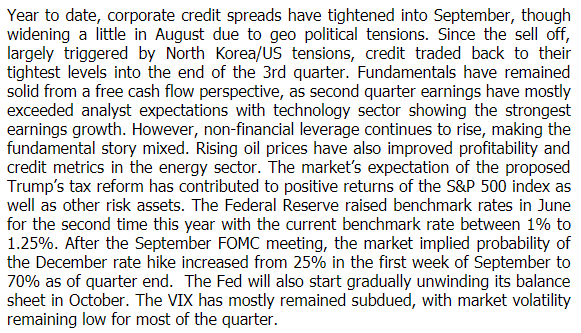
Here’s a screen shot of some bond market commentary that I received via email in November. It could use some help. (By the way, I’m not out to embarrass anybody. Before I started critiquing this piece, I googled the text to make sure the author couldn’t be identified easily.) Let’s analyze and rewrite this piece.

bond market commentary


What’s good and bad?

One good thing about this commentary is that it was published promptly after the end of the quarter. Most commentary takes days if not weeks to get published. The speedy production cycle probably meant the author didn’t have lots of time to process his or her ideas. Nor was there much time for editing or proofreading. It’s not easy to pump out clean commentary under these circumstances.

Let’s look at the commentary’s weaknesses.

  1. It lumps together a bunch of sentences that don’t stick to a single theme. It jumps around chronologically, going from September to August to October to second quarter to June to September to October. The subject-matter progression is a little better organized, going from credit to risk assets to the Fed to the VIX. However, these subjects shouldn’t all be in one paragraph because the author doesn’t write about them in relation to each other.
  2. The paragraph lacks a topic sentence that says why all of these items are grouped together.
  3. The paragraph is dense and intimidating.
  4. It’s confusing that the paragraph writes about October as if it’s in the future, saying “The Fed will also start gradually unwinding its balance sheet in October.” Did the person mean to write “November”?
  5. It’s strange to start the Fed section with old news from June. it’s better to start the section in the present, as you’ll see in the rewrite below.
  6. The paragraph has grammatical errors. Credit doesn’t trade to “their tightest levels.” It should be “its tightest levels.” “The proposed Trump’s tax reform” should be “Trump’s proposed tax reform.” It’s a little light on commas for my taste.
  7. The paragraph has a spelling error. “Geopolitical” is one word.

Note: I give a pass to this commentary for using technical language, such as “credit,” “risk assets,” and “FOMC” because this commentary is aimed at practitioners. It’s fine to write in the language of your audience. In fact, it’s appropriate, as long as you don’t expect regular folks to understand you.

My thoughts about how to rewrite this piece

The main change I’d make to this piece is to reformat it. I think this piece was intended to provide some quick information without building a bigger argument, so I’m not writing an introduction or strong topic sentences. I am, however, adding bullet points and headings.

I don’t follow the bond market closely so I may make some factual errors in my rewrite.

I raise some questions about the content in red text.

My bond market commentary rewrite

Third quarter 2018 review

  • Corporate credit spreads: Corporate credit spreads tightened into September, after widening a little in August due to geopolitical tensions. Since the September sell-off, largely triggered by North Korea/US tensions, credit traded back to its tightest levels [tightest since when?] into the end of the third quarter.
  • Bond market fundamentals: Fundamentals have remained solid from a free-cash-flow perspective, as second-quarter earnings mostly exceeded analyst expectations with technology sector showing the strongest earnings growth. Rising oil prices improved profitability and credit metrics in the energy sector. However, non-financial leverage continued to rise, which is a negative.
  • Risk assets: The market’s expectations for Trump’s tax reform proposal contributed to positive returns for the S&P 500 index and other risk assets.
  • Fed policy: The fed funds rate is currently between 1% to 1.25%, following the Fed’s raising rates in June for the second time this year. The market-implied probability of a December rate hike increased from 25% in the first week of September to 70% as of the quarter’s end. The Fed is expected to start gradually unwinding its balance sheet in [what month or time period?].
  • VIX: The VIX has mostly remained subdued, with market volatility remaining low for most of the quarter.


If you’d like to read some well-written fixed-income commentary, check out the links in my post on “Who are the fixed-income commentary winners–and why?


One investment manager’s approach to writing commentary

Writers tailor their processes to their needs. Leslie J. Lammers, CFA, of Riverstone Advisors, shared her process with me after reading my post, “A case against writing outlines.” Lammers has used this process to write almost 100 quarterly letters.


My approach to writing investment commentary

By Leslie J. Lammers, CFA

Here is my process:  do the research, hone in on your central points, put butt in chair, attach fingers to key board, go to the zone.

To write a letter that communicates, you have to have a view and have conviction in that view. If your view is not clear to you, do more research.  Read as widely as you can across the financial world.

If you are writing quarterly, start collecting articles at the beginning of the last month of the quarter. Sign up to receive pieces from various sources. Read Bob Johnson on Morningstar, read Cramer, sign up for Cam Hui on his own site, find some people you like on Seeking Alpha, sign up for Economy.com to read Mark Zandi and others on that site. The Bank Credit Analyst is also excellent.

Find some comments you believe in and build your view from there if you don’t already know what it is.

When you sit down to write, picture your average client and write to them as though they are sitting across the desk from you.

Art helps clients grasp the concept and retain it. You can easily find a graphic artist on ifreelance.com or other websites. Here is an example of one we had done.

If proper English usage is not your strong suit, pay an editor.  If you have a college near you, you can find someone who edits student papers.  Or use a freelancer website to find an editor.

You must write with conviction.  Adopt an attitude of “sometimes wrong—never in doubt.”


If you’re looking for great investment or wealth management commentary, you may find some in “Who are the fixed-income commentary winners–and why?”,Wealth manager blogs that my readers like,” or “Market commentary with wit and wisdom.” These lists were compiled with suggestions from my readers.

Given Lammers’ emphasis on writing with conviction, you may also enjoy “Are financial predictions too risky for investment commentary writers?

Words to avoid in your investment communications with regular folks

Big words make your readers work harder to grasp your message. This is particularly true of jargon, such as “duration,” unless your piece is strictly for investment professionals.

Below are some words to avoid when communicating with regular folks. Most of them are financial jargon. Others—like “mitigate“—are unnecessarily long or confusing. Replace jargon and long words with shorter, less technical words that pack more punch. They also make it easier for readers to absorb your message.

  • Accommodative monetary policy
  • Active share
  • Alpha
  • Barbell
  • Basis points
  • Beat, when used as a noun to refer to beating analyst forecasts
  • Bet
  • Comp
  • Compute as a noun or adjective
  • Conditional value at risk (CVAR)
  • Constructive, as in “we are constructive on small-cap stocks”
  • Contango
  • Convexity
  • CorrectionCorrection means something different to individuals than to investment professionals
  • Dead money
  • De-gross
  • Disseminate
  • Downside deviation
  • Drawdown
  • Duration
  • Ecosystem
  • Efficient frontier
  • Ex-, as in “ex-Japan”
  • Ex-growth
  • Expected return
  • Exposure
  • Externality
  • Fiscal
  • Flight to quality
  • Growth wall
  • Headwinds/tailwinds
  • Inverted yield curve
  • Kurtosis and other statistical terms (copula, eigenvectors, semi-deviation, subadditivity, etc.)
  • Leverage
  • Levered names
  • Liquidity
  • Long/short
  • Mean-variance optimization
  • Mitigate
  • Modern Portfolio Theory
  • Monte Carlo analysis
  • Orthogonal, which apparently is used to mean “uncorrelated,” although that doesn’t appear in the dictionary definition of the word
  • Pricing power
  • Rerate
  • Reversion to the mean
  • Risk assets
  • Risk on/risk off
  • Risk premium
  • Risks to the upside
  • Runway, when not referring to an airport runway
  • Secular
  • Sharpe ratio
  • Size up
  • Spanning a broad risk/return spectrum
  • Spread product—A Google Alert on “spread product” yielded results related to margarine and Vegemite.
  • Spend (as a noun)
  • Stack ranking
  • Tranche
  • Universal asset owner
  • Use case
  • Value at risk (VAR)
  • Value traps

On a related note, don’t use acronyms without first defining them. This means words such as AUM, CAGR, CAPM, CLO, DOL, EBITDA, EPS, LIBOR, MBS, MLP, TTM, YOY, and YTD. It’s often best to avoid acronyms completely. I’ve discussed this in “How to capitalize financial acronyms.”

If you’re writing an educational piece for regular folks

It’s okay, even admirable, to educate your regular Jane or Joe investors about complex financial concepts.

When you write to explain technical vocabulary, make sure you:

  • Define your terms using plain language. You can introduce the technical terms and then define them using the techniques in “Plain language: Let’s get parenthetical.”
  • Mention the WIIFM (what’s in it for me) so readers know why they should slog through the explanation.
  • Explain the benefits of the complex financial concept for regular folks. For example, don’t use a multi-billion dollar pension fund as your key example unless your readers are participants in a similar plan.
  • Use analogies, where possible, because they’ll stick in your readers’ minds better than dry explanations.

Must you bore sophisticates?

You may worry that your content will bore sophisticated readers if you go easy on technical vocabulary. No, you won’t. Not if you do it right.

Read “How to make one quarterly letter fit clients at different levels of sophistication” for my take on how to keep everybody happy.

If you’re communicating with other investment professionals

Some jargon is okay if your communications go exclusively to other investment professionals. In that context, jargon can act as a kind of shorthand. For example, “basis points” can be used in a way that’s more precise than “percent.” “Spread product” is more concise than the definition of “spread product.”

However, if you’re targeting institutional investors, don’t assume that they’re all sophisticated consumers of investment content. An investment committee, for example, can include less sophisticated members.

Still, there’s no need to make your professional communications overly complex or wordy.

Your suggestions for words to avoid?

If you can suggest words to avoid in your investment communications, please share them in an email or social media post to me.


Updates: I updated this on April 6, 2017, and Dec. 20, 2019 to add words suggested by my readers. I also updated on Dec. 16 and Dec. 23, 2019; Jan. 2, 2020;  Jan 29, 2021; July 27, 2023; March 3, 2024; April 24, 2024. I appreciate the support of my readers. Thank you!

Image courtesy of Sira Anamwong at FreeDigitalPhotos.net

Mind maps: can they win buy-in for your writing?

“Do you ever circulate mind maps for buy in from executives at firm that you are writing for? For example, chief investment officer or marketing executives?” This question arose during my latest investment commentary webinar. I am a big fan of using mind maps in the writing process.

Most people know mind mapping as a visual, nonlinear way of brainstorming ideas. You put your ideas on paper so you can look at them from a bird’s eye perspective. This lets you identify patterns, prioritize ideas, and organize, without getting bogged down in details.

I rarely share mind maps with my clients, but I’ve found them powerful in the right situations. My experience sparked some thoughts about how you might use them to win over your bosses or subject-matter experts as you develop investment commentary, white papers, or other content for your investment or wealth management firm.

The right time to introduce mind maps will depend on the person whose buy-in you seek. Are they open to visual aids or do they need to see ideas fully written out? Will they brainstorm with you? Can they commit to content at the idea stage?

Here are some ways that you might introduce mind maps into your approval process. By the way, unless you’re a very neat writer, you should use mind mapping software to produce readable maps. I currently pay for a subscription to MindMeister, but there are many other options.

1. Brainstorm with your subject-matter expert or marketer

At the brainstorming stage, your mind map identifies what you think will be your main themes. However, you haven’t yet finalized your themes or organization. Your map will be messy. It may overwhelm a viewer who craves order or who’s not used to looking at mind maps.

However, if you’re working with a person who likes to brainstorm, then a mind map that displays relevant ideas can help you discuss which of the many possible paths you should take. For example, you might point to a cluster of ideas around a specific asset class. Do you focus a section on that asset class or do you integrate it into a discussion of a broader trend that also appears on your diagram?

This might be especially helpful if you work with subject-matter experts who typically go through several drafts because they need multiple drafts to spark new ideas. Your mind map could accelerate their ability to see new ideas and connections with different parts of your mind map.

Mind mapping software can help you and the other person collaborate. You can allow more than one person to edit the mind map. Participants can also add relevant links and documents, such as an Excel spreadsheet or a provocative article.

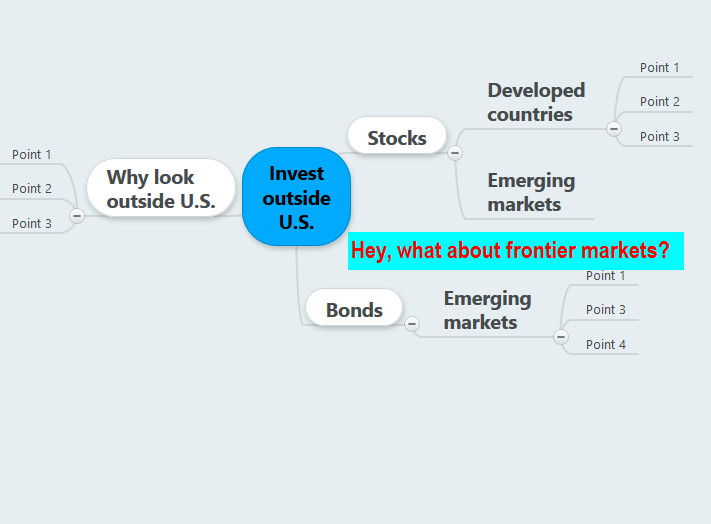
In the example below, the participants realized that they’d forgotten to consider frontier markets.

Mind map: what about frontier markets?

2. Review your overall approach to the topic

If you want someone to sign off on your “big picture” approach to a topic,  consider showing them a second-round mind map.

When I write complex stories, I use the first mind map to identify my themes and organization. Then, I draw a second mind map that’s organized to show only relevant information in the order in which I think it will work best. When you show someone a second-round mind map, they won’t be distracted by other potential directions. Plus, they can more easily grasp your plan than in a first-round mind map, where you may need to explain how you’ll reshape the raw data.

Why not just show them an outline? An outline takes more time to write. Plus, it makes the organization seemed more final. That’s not good if you want to encourage them to tweak your approach to improve it.

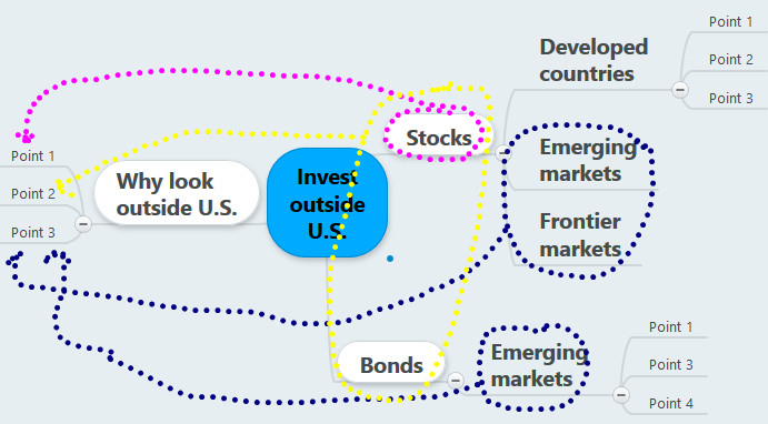
Viewing the next mind map helped the participants decide that their piece should be organized in terms of the three broad reasons to invest outside the U.S. The dotted lines show the topic areas from which they’ll draw their evidence.

review of mind map invest outside the U.S

3. Dig into the details

If your colleague wants to see all of the supporting details before you write, mind maps can help.

If you’re writing a short piece, you might drop all of your data into a mind map before reviewing it with your expert or other co-worker. For a longer piece, that’s too time-consuming. However, if you use software to attach a file or a link with detailed data, then you easily answer your co-worker’s questions about the nitty-gritty details.

4. Diagnose what’s wrong

In direct interactions with clients, I’ve most frequently used mind maps to diagnose what’s wrong with written pieces.

I’ve sometimes done this interactively with clients looking at my mind map in MindMeister from their desks somewhere else in the U.S., while I work in my office. I start with a map in which I’ve diagrammed the piece’s current organization. If the piece is short enough, I go paragraph by paragraph and sentence by sentence.

One of the big questions I ask is essentially, “Does the piece place like with like?” Placing like with like is a “Key lesson for investment commentary writers from my professional organizer.” The visual aspect of mind mapping makes it easier for my coaching clients to see that content is misplaced.

5. Harvest ideas for the next piece

Financial writers always need more ideas for future articles, investment commentary, and white papers. Look at your original mind map with your subject-matter expert or other colleague. You may identify gems that didn’t fit in your current project.

Don’t force mind maps on people

Some folks love mind maps. Others can’t stand them. Even if you love them, you can’t force someone whose mind works differently to join in your enthusiasm. Don’t push it.

Market commentary for index investors

Market commentary is an important client communication and marketing tool for investment and wealth managers. Making predictions can be particularly powerful, as I said in “Are financial predictions too risky?

But what if you’re in the camp of index investors—or similar strategies, such as evidence-based investing—or if you simply don’t believe in market timing? You may skip market predictions on principle, as my friend, writer Wendy Cook, suggested in conversation with me. You won’t say which asset class will outperform next. Nor will you predict the meeting-by-meeting decisions of the Federal Open Market Committee and how they’ll affect stocks, bonds, and interest rates.

Index investors can’t totally avoid predictions

You can’t totally avoid predictions, in my opinion, when you communicate with the clients for whom you manage money. You just make a different kind of prediction than your peers who rejigger their portfolio holdings and asset allocations as their predictions change.

For example, index investors may predict that the current trendy asset class—or investing in high-fee, actively managed portfolios—will not pay off over the long term. You may also encourage investors to “stay the course” based on historical evidence. This helps you convince investors to stick with their current asset allocations until their personal circumstances change. This kind of prediction focuses more on long-term truths backed by the historical record. It’s part of active managers’ predictions, too, but to a lesser extent.

You’re trying to solve your investors’ challenge of “Consuming financial news without being consumed by it,” as Wall Street Journal columnist Jason Zweig points out in a blog post recommended to me by Wendy Cook.

Index investors still need commentary

If you manage an index fund, you need to put fund performance in perspective. Your investors want to know why returns were positive or negative. They may also care about why your fund performed the way it did relative to your index and the broader market. Relative performance is particularly important when your fund performance differs greatly from your index.

This means discussing what drove the fund’s performance, which could include:

  • Individual stocks that outperformed or underperformed—while you’re not a stock picker, telling the story of your fund’s best- and worst-performing stocks gives insight into what drove performance during the period.
  • Factors influencing the index’s performance during the period—for example, if you run a value-oriented index fund, your fund’s performance will suffer relative to broader or growth indexes when growth stocks outperform.
  • The way that your fund attempts to capture index performance—your fund probably doesn’t invest in every single stock in your index in the exact same proportions as the index. Portfolio holding differences can make performance diverge from the index.
  • Your fund’s cash position and inflows or outflows—if your fund’s positioning differs from the index, it won’t perform like the index.
  • Fees and expenses—one can’t invest directly in an index. Funds have expenses, such as management fees and transaction costs, that cut into their ability to achieve index returns.

If you’re an advisor using index funds

If you’re an advisor using index funds, you may share commentary from your fund providers with your clients.

To get the most mileage out of sharing that third-party commentary, add your personal observations. For example, “The strong performance of ASSET CLASS, which underperformed dramatically last year, reminds us of the value of staying fully invested.”

I believe index investors need commentary, even if they’re invested for the long term, with little change in their allocations. What do YOU think?

Image courtesy of hywards/freedigitalphotos.net


Amp up your writing with investment commentary top posts

Investment commentary is a focus of my writing, editing, and teaching. To help people get a quick idea of what’s most important about writing investment commentary, I’m sharing my investment3Cs of investment commentary InvestmentWriting commentary top posts. Click on the headings to read the posts that I’ve selected. If you’d like to read more of my classic investment commentary posts, buy my mini e-book, Investment Commentary: Best Tips From InvestmentWriting.com. You can also get advice directly from me inn my on-demand webinar, “How to Write Investment Commentary People Will Read,”

1. Ideal quarterly investment letters: Meaningful, specific, and short

There’s an industry consensus about what makes for the best quarterly investment letters. My survey research says that they are “meaningful, specific, and short.” You can’t simply spout what everyone else is saying. Put some spin on the content so it supports a point of view that’s relevant to your target audience. Don’t drone on and on.

2. Investment commentary numbers: How to get them right

It’s so frustrating when you slave over a piece of investment commentary only to find after publication that a wrong number has sneaked into your piece. I was mortified when this happened to me. As a result, I’ve developed a system for minimizing the number of errors that sneak through. I share my system with you in this post.

Unfortunately, it takes time to get things right. There’s no substitute for careful proofreading. Even with careful proofreading, you’ll sometimes have problems. For example, sometimes index providers revise their numbers for index returns. You can’t help that.

3. Are financial predictions too risky for investment commentary writers?

Should you make predictions in your investment commentary? In this post, I argue that economic and market predictions can help by giving readers insight into the way that you and your firm think about investments. Of course, proponents of index investing—and similar styles, such as evidence-based investing—may skip predictions on principle, as my friend, writer Wendy Cook once suggested in conversation with me. However, even for those investors, I believe there’s some value to interpreting what’s happening in the stock and bond markets.

Learn an investment commentary process in my webinar!

I teach you how to achieve the 3 Cs of great investment commentary in my webinar.


5 rules for using quotes in investment commentary

Smart investment commentary writers are willing to learn from others. That’s why I was delighted when Rob Martorana shared the thoughts below in response to my post, “Should you use quotes like Bill Gross?” His rules about using quotes deserve wider circulation.

By the way, this blog post is a testament to the power of LinkedIn for connecting people. I met Rob thanks to the serendipity of his commenting on one of my earlier status updates on LinkedIn. This is a great reason to be on LinkedIn.

5 rules for using quotes in investment commentary

By Rob Martorana

I agree that quotes should not be “teaser” content. If Bill Gross opened his article by quoting “When I’m 64,” the article should be about aging. Authors should use quotes carefully, and always with their audience in mind. Here are five rules I try to live by:

Martorana_headshotRule #1: Do not quote ancient philosophers when the market is crashing.
That annoys clients to no end. Investors do not want to hear from Sun Tzu and the Art of War after they just lost $100,000.

Rule #2: Do not quote people out of context.

Show that you understand who said it, when they said it, and what they meant by it. Don’t put words in the mouth of the person you are quoting.

Rule #3: Do not quote out of cowardice.

If you want to say something controversial to the audience, just come out and say it. Don’t hide behind the authority of a historical figure.

Rule #4: Keep your wit on a short leash.

Quotes are often used to entertain and amuse, rather than to illustrate and illuminate. This is related to rule 5…

Rule #5: Get to the point quickly.

Remember that “brevity is the soul of wit.”

Investment writing should be clear, concise, and concrete. Don’t take me down a rabbit hole to show off your knowledge of Milton Friedman or Michel Foucault.

Rob Martorana owns an RIA in New Jersey, where he manages money, publishes articles, and provides competitive intelligence on the wealth management industry. His research interests include portfolio design, expected returns, liquid alternatives, and the digital delivery of investment advice.

Who are the fixed-income commentary winners–and why?

Learning about new sources of fixed-income commentary was the biggest benefit of running my survey about “Who writes the best fixed-income commentary?” (see the original survey, which is still open for comments). You’ll find the recommendations of my industry connections below.

The survey also showed me what financial professionals think makes fixed-income commentary great. I’m grateful to my LinkedIn connections, including many professional investors, who shared their insights. I’m no bond geek, so I enjoyed learning from the professionals. Although survey participants were anonymous, I believe that many of the respondents come from among the fixed-income professionals whom I asked to take the survey.

The race for the #2 spot

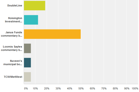
Bill Gross of Janus Capital killed the competition in this survey. He racked up 50 percent of the vote. This doesn’t surprise me. After all, he’s one of the first portfolio managers whom most people think of when asked to name a fixed-income commentator.

My initial survey asked people to vote on a predetermined slate of candidates, which I’d collected via LinkedIn. But it also allowed for write-ins.

Below are the winners from among the names suggested for votes, along with comments that survey respondents made about them. I’ve included a link to what seems to be the best source of the investment commentary that my respondents enjoyed. I’ve also shared some of the respondents’ comments on the contenders.

  • Janus commentary by Bill Gross—Respondent 1: “Authoritative – influences conversation and identifies themes that everyone else parrots.” Respondent 2: “Touches on the macro issues driving the fixed income markets in a way that usually engages the reader. Tangents make it interesting.” Respondent 3: “I don’t typically work with fixed-income securities, but regularly read Bill Gross’ reports to help find interest rate trends and get insights into where bond yields/inflation might be heading. Bill’s commentary always comes with personal anecdotes, light humor, and likeability.” Respondent 4: “He has a breezy, confident style that draws you in. Bill has written for decades, and has a clear ‘voice.’ He used to read it aloud in a podcast, and his cadence and phrasings are quite distinctive and natural.”
  • DoubleLine
  • Hoisington Investment Company—”Lacy Hunt is great Fed watching commentary“; “Opinions expressed are based on big picture macro views.”
  • Loomis Sayles commentary by Dan Fuss—The PDF commentary for the Bond Fund seems a bit bland compared to the colorful commentary that I’ve heard Fuss share in presentations to the Boston Security Analysts Society. Perhaps his fans are responding to his commentary delivered on TV or in interviews. Or perhaps there is meatier commentary hiding elsewhere on the Loomis Sayles website.
  • Nuveen’s municipal bond commentary by John Miller
  • TCW/MetWest—”TCW MetWest has, in our opinion and for our investment consulting purposes, the best quarterly fixed-income market commentary. They release talking points shortly after quarter-end and then a more developed review a couple of weeks later.”

Best firms for fixed income commentary

More fixed-income commentary contenders

A number of people wrote in suggestions that weren’t included in the vote tally. I’m including their comments, when appropriate. I also include a link to what I believe are the online sources to which survey participants referred.

  • BCA Research (this is a paid service, but you can sample the firm’s insights on The BCA Blog)—”It’s designed to meet my needs and interests and not those of the firm sponsoring the commentary.”
  • Bloomberg Credit Research team (you’d need a Bloomberg terminal to access their content)—”The insights are fantastic and because it is on the terminal, I can easily use their charts and graphs and Excel sheets.”
  • Bond Squad, a paid service—”independent, frank, timely, unconflicted, and written by someone who has worked with both institutional and retail investors for 30+ years. I consider daily e-mails/weekly longforms must reads.”
  • Brean Capital’s Peter Tchir (@tfmkts) who blogs on Forbes—for “macro strategy and asset allocation. Brean’s stuff…takes you through an argument for or against a positioning or the rationale for a market move and how to benefit by it. It’s about info and context.
  • Cumberland Advisors—no one commented on this commentary’s strength, but I used it to illustrate my first-sentence check approach to editing your own writing.
  • Goldman Sachs Asset Management—”great weekly letters, on a variety of topics including the broader economy, but often is insightful and more timely than quarterly pieces, especially since the markets seem to move faster these days than ever before.”
  • Grant’s Interest Rate Observer,  a paid service—gets into issuer-level detail that is a bit deeper than some need.
  • Janus Capital’s Fundamental Informed quarterly commentary—”The piece is more formal than Bill’s at times bizarre monthly commentary and takes a serious look at what is driving their fixed-income decision-making.”
  • Guggenheim—”not as product driven as many others, tends to have more independent views and writes on a sophisticated level rather than for general retail investor audience”
  • Municipal Market Analytics‘ Matt Fabian (paid service)—”Clear and concise combination of economic, fundamental, technical, political [factors]”
  • Oaktree Capital’s Howard Marks—”Topical” and “really insightful”
  • PIMCO’s Harley Bassman—”Experienced, easy to read”
  • PIMCO, other sources—”We don’t rely on any general market commentary from PIMCO, but rather read their ad hoc stuff religiously. But the real gem out of PIMCO is usually their verbal comments on webcasts (like on AssetTV) if you can see past their infomercials (ie, they plug themselves shamelessly).”
  • The Rieger Report on the Indexology Blog of S&P Dow Jones Indices—”The information provided is independent and unbiased. The reports are not trying to sell or convince anyone to invest in a particular product instead they are arming investors with information to make decisions.”
  • Wilmington Trust’s  Stephen Winterstein—”He presents an interest-rate agnostic view of the fixed income world (in other words he doesn’t waste time focusing on the unknowable . . . interest rate directionality). He does focus on credit analysis and larger geographic trends where his experience and conviviality shine.”

Explaining why they didn’t go with one of the big names, one respondent said, “In general I feel that [Doubleline’s Jeffrey] Gundlach and Gross ‘talk their book’ in their commentaries. They are good to read, but with a jaundiced eye (I am a fixed income guy!)

What makes fixed-income commentary great?

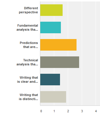
Survey respondents gave roughly equal top billing to the following characteristics of great commentary, ranking the characteristics on a scale from 1 “Most important” to 5 “Not at allWhat makes fixed incoome commentary great? important”:

  • Fundamental analysis that’s good—one respondent said, “Facts and figures are great but context and implications are key.”—Average ranking 1.5
  • Writing that is clear and easy to understand—I was delighted with the comment that “To be GREAT, it must be concise and jargon-free, or at least low-jargon.”—Average ranking 1.5
  • Different perspective—Average ranking 1.63

Next came “Writing that is distinctive and colorful.”

Lagging far behind were “Predictions that are accurate” and “Technical analysis that’s good.” As for accuracy of predictions, on respondent said, “I actually think it’s more important to understand their rationale (and agree or disagree) rather than merely accept anyone’s opinion as fact.”

Another factor, which I gleaned from comments on respondents’ favorite commentators, is that my respondents liked commentary that focused on the readers’ needs, rather than on promoting the firm or its investment strategies. That makes it tough for fund managers to excel.

How great fixed-income commentary differs from great commentary about other asset classes

Here’s my summary of what people said in their open-ended comments about what distinguishes great commentary about bonds:

  • It matters more, said a respondent who believes that “bond markets drive stock markets long term.” On a related note, another respondent said, “Fixed income is the area that is most important to identifying global-macro trends and future economic prospects by looking at the current situation on yields vs. interest rates and where they are headed; stocks are volatile and always changing; other asset classes are in a league of their own.”
  • It’s more oriented to the longer term, with “less emphasis on daily tactical or daily news type of hyperbole.”
  • It’s more diverse because each bond sector has unique characteristics.
  • It shows awareness of whether the buyers are investors or traders and the diverse purposes (total return/income/diversification/safety) for which fixed-income is used.
  • Unlike commentary about stocks, which is about stories, commentary about bonds, is “about stories as well as math, f/x, economics, and liquidity.” This seems to relate to another person’s comment that “Fixed income commentary should be based on top-down analytics.”

Annoying habits of top fixed-income commentary writers

The commentators whom I’ve discussed would be even better if they could clean up some issues with their writing and presentation, in my opinion.

Here are the annoying habits that I noticed as I viewed their writing samples.

  • They are guilty of “Bloggers’ top two punctuation mistakes” and other usage mistakes. I can understand their firm’s editorial staff allowing them to have distinctive voices. However, I’d like to see the editors rein in outright mistakes, such as writing “the gap has broached” instead of “the gap has breached.”
  • They use too much jargon, especially if their commentary is aimed at individual investors. They could learn from Donald Trump and ask themselves “What would The Wall Street Journal do?

You can improve YOUR investment commentary writing with my June 23 webinar.


Fonts: By the numbers

The look of your financial reports makes a difference in the effectiveness of your communication. Fonts are part of your toolkit, as Professor Joyce Walsh explains in her guest post.

Fonts: By the numbers

By Professor Joyce Walsh, Boston University, College of Communication

Walsh_JoyceFor financial professionals, numbers are the heart and soul of client communications. But working with them in documents, presentations and online can be painful. Anyone who’s wasted an hour trying to get the decimal points to line up in a vertical column knows what I’m talking about.

Fortunately, there are ready solutions to numerical challenges. And they come from an unlikely source: your choice of font. You’ve probably spent some time considering the right font for your written material. (If you haven’t, you can read this paper I wrote about typography for financial professionals.) But the right font can also make your numerical life much easier—and your client reports and marketing material more effective.

If you’re having trouble with numbers in your documents and presentations, here are solutions to five common problems:

Problem #1: My numbers don’t align properly in columns

Arranging a column of numbers is a standard feature of most financial and investment reports. Whether you’re showing the market caps of your top 10 holdings or presenting a balance sheet, your figures need to stack up in an orderly way, with all decimal points in vertical alignment. If yours don’t, it’s because your font choice uses proportional figures, where each character varies in width. When 8s take up more space than 1s, your column will never line up properly.

The solution: Use a font that offers tabular figures, where each number is the same width on the page, and 1s take up the same horizontal space as 8s. If your default font doesn’t have a tabular option, consider investing in one that does or use a different, complementary font when presenting a numbers in a column. Many font families, like Gotham, offer both proportional and tabular options.

Pro tip: Not sure whether font figures are proportional or tabular? Here’s a quick way to find out: Type a line of 1s, then type a line of 0s underneath it. If the two lines end at the same place, the numbers are tabular.

Problem #2: When I bold a number in a column, it bulges out

Using bold is a great way to call attention to a significant number. But even if you’re using tabular figures, doing so can still throw a column out of alignment. If this happens to you, it’s because your font doesn’t have weight-duplexing figures.

The solution: Invest in a font that offers weight-duplexing, a feature that allows bold numbers to stack without bulging out of columns. Whitney, a font by Hoefler & Co., is a good example.

Pro tip: Speaking of bulging—10- and 12-digit numbers are common in today’s financial world, and they can wreak havoc in the best of layouts. Consider using a font that offers condensed numbers, which are designed to fit big numbers into narrow spaces without losing their readability or visual appeal.

Problem #3: When I use numbers in the body of a report, the spacing doesn’t look right

Financial professionals often use figures within the body of a report. And, yes, sometimes they just look off—the spacing seems out of whack or the numbers appear to be larger or smaller than the surrounding words. That’s probably because you’re using tabular figures instead of proportional ones. Within any font family, proportional figures are more like letters in their overall shape and appearance, and they tend to be more evenly spaced.

The solution: Always use proportional figures in running text or the body of a document. Their variable width makes them easier to read and lends a more harmonious feel to the content.

Pro tip: Beware of fonts with old-style figures, where the numbers approximate the size and shape of lowercase letter forms. While they work in a sentence, they look tiny and out of place in ALL CAP headlines. You’re safer with a font that offers lining figures, which are all-cap height and work well everywhere. Fortunately, most common system fonts default to lining figures.

Problem #4: I need more currency symbols for my reports

As the global economy expands to include emerging and frontier markets, forward-looking financial professionals need a font that goes beyond the dollar, pound, euro and yen to include symbols for currencies such as rupees, pesos and the new shekel. While it is possible to enter special numbers and codes to produce them, the process is slow and labor-intensive. If you use international currency symbols frequently, it’s just not practical.

The solution: Invest in a font family with extended currency symbols. Gotham, Mercury and Whitney are good examples of fonts with a wide range of monetary symbols.

Pro tip: If you want to make your articles, reports and presentations more useful and attractive for your audience, consider purchasing a font family that offers an extended character set. These typically include vertical and diagonal fractions, ordinals, and advanced mathematical and statistical symbols. Some even come with indices—circles with numbers in them—a very handy item if you want to compare plot points on a graph or add a distinctive touch to financial footnotes and disclosure references.

Problem #5: I need charts in my WordPress blog

The solution: You can apply the principles discussed above and post your charts as graphic files, such as JPGs or PNGs.

Pro tip: If you want to create charts and graphs while in WordPress, you will need a plugin. The WordPress Chart plugin is free and customizable, but is not user-friendly. Visualizer is also a free WordPress Plugin but is much easier to use. Just save your Excel XLS file as a CSV file. Then create a chart in the WordPress editor by selecting Add Media > Visualizations. To display the chart, simply add its shortcode to your post.


About Professor Joyce Walsh

Professor Walsh’s work has been featured in publications, exhibitions and corporate art collections around the world. Her book, Graphic Design Essentials: Skills, Software and Creative Strategies, was the first book to combine design fundamentals with creative software skills

Business data analyzing image courtesy of alexisdc/FreeDigitalPhotos.net

t

Investment commentary numbers: How to get them right

Investment commentary calls for lots of numbers: benchmark and portfolio returns, economic data, and more. When you get those numbers wrong, you undercut your credibility and embarrass yourself.

I have some ideas about how you can avoid mistakes by proofreading and checking your facts.

My expensive mistake

A bad experience impressed me with the importance of checking numbers. Reading the professionally printed copy of my employer’s third-quarter commentary, I noticed a goof. It referred to the second quarter, instead of the third quarter, in one spot. This happened even though four of us had read the piece before it went to the printer. However, the eye tends to read what it expects to see. We all glossed over my error. Oops!

That was an expensive mistake because we had to get the piece reprinted. However, at least we avoided the embarrassment of clients seeing our mistake. Also, it spurred me to develop techniques for catching numerical errors.

Tip 1. Add numbers to your checklist

Checklists, which I recommend in “5 proofreading tips for quarterly investment reports,” can help you catch numerical errors. For a typical quarterly investment publication, I’d add two kinds of numerical items to remind you to check for accuracy and timeliness.

  • Calendar information—record the current year, quarter, and ending date for the quarter. I don’t know about you but I sometimes can’t remember how many days there are in June so it’s handy to know that I should write about “the period ended June 30.”
  • Major index returns for the relevant periods—if you’re writing about multiple investment styles and periods, you’ll use multiple index returns. If possible, run a report that shows only the relevant returns and displays them in a logical order. If you lack the access to run or customize reports, create your own list and proofread it carefully.

After you’ve completed your writing, make one pass through your document to check that you’ve used the right calendar information and returns.

Tip 2. Standardize your sources for index returns

If you’re new to writing about investments, you might think, “The S&P 500 Index return for the fourth quarter is the S&P 500 Index return for the fourth quarter.” Uh uh. There’s not just one number. For example, the return number that comes directly from Standard & Poor’s may diverge from the number spit out by your firm’s performance measurement system. Which will you use?

Your firm needs to decide which are the official sources for index returns. And then, stick with using those sources. By the way, it’s also good to create a rule for how many places to the right of the decimal point you’ll go in reporting returns.

You should create similar rules for reporting portfolio returns, too.

Tip 3. Document sources for other numbers

What about sources for other numbers? Document those as you write.

Footnotes can track your sources. Insert a footnote with your data source. Insert a link to the data if one is available. It’ll make fact-checking easier later on.

Tip 4. Use a fact-checker

Just as it’s hard for you to proofread your own work, it’s hard for you to fact-check it. You’ll tend to see what you expect to see.

If you have an employee, colleague, or friend who can help, ask that person to compare every number to its approved source. Being unfamiliar with numbers, they’re more likely to pick up on mistakes.

Don’t have a helper? Fact-checking will still catch some errors. I know it works for me, especially if I concentrate solely on fact-checking in one pass through my document.

Tip 5. Catch contradictory numbers with informed readers

How can you catch two authors using contradictory numbers? Say, for example, one author says U.S. economic growth was 2.2% while another says it was 2.5%. Both provide a source for their numbers, as suggested in Tip 3, but they don’t match. If you’re lucky, your fact checker will catch the disparity. But you can’t count on it.

There’s a higher chance of catching the error if you have the two authors with overlapping topics read each other’s articles. Ask them to look for inconsistencies. Another approach is to get a third party to look for inconsistencies. You might even ask them to list all of the document’s numbers from non-standardized sources. That would make it easier to see that there are multiple sources for a single number. All of this takes a lot of time.

There’s no easy way to catch these contradictory numbers. If you have ideas about how to solve this problem, I’d like to hear from you.

Image courtesy of Stuart Miles at FreeDigitalPhotos.net