Reader challenge: What makes advisor websites outstanding?
What do YOU think makes for an outstanding advisor website? Please share your thoughts below.
Advisor-recommended websites to spark discussion
I recently asked my readers for examples of outstanding money manager websites. Below you’ll find screen shots with links to the home pages for their recommendations. Plus, I’ve linked to the sites of the two people who made recommendations.
Tell me what you like about these sites. Do they do things you’d like more advisors to do?
To facilitate discussion I’ve numbered the websites, which are listed in alphabetical order. I’ve also shared at least one of my impressions of the site. But my comments are not comprehensive.
1. Capri Capital Partners
Nice clean look. Good tag line.
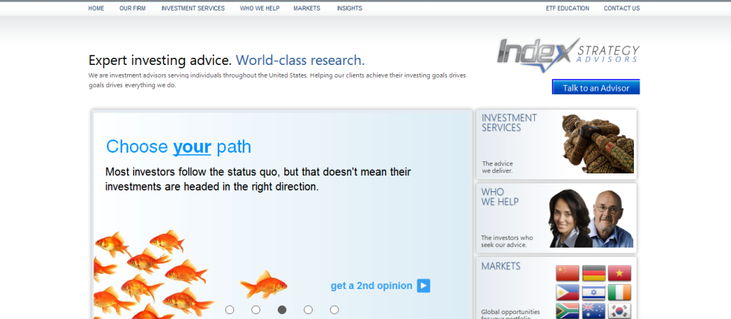
2. Index Strategy Advisors
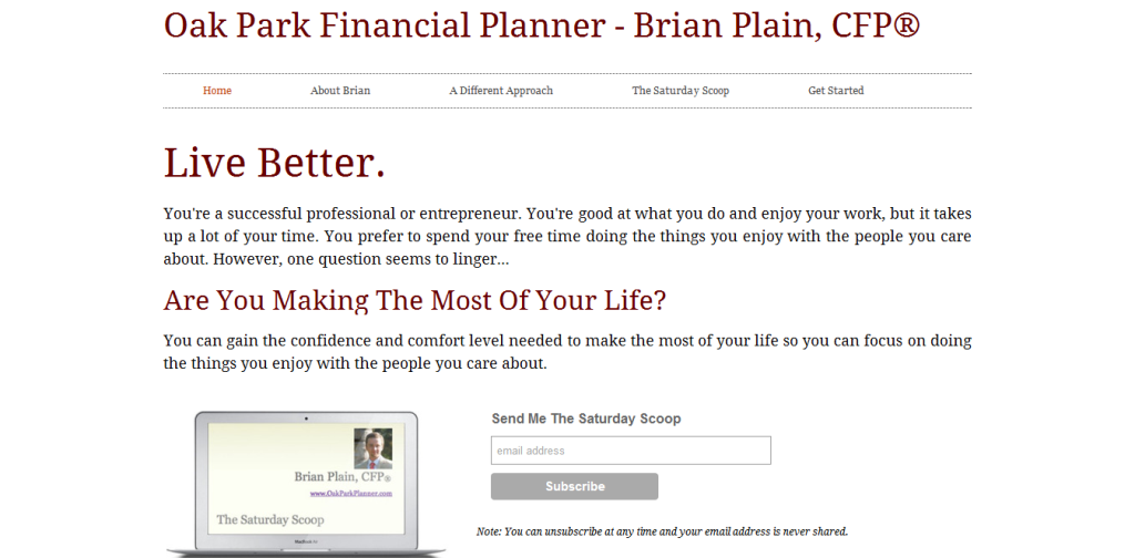
3. Oak Park Financial Planner
This website speaks to “you,” the potential client. Too few advisor websites do this. It also has a newsletter subscription box displayed prominently “above the fold,” which means the reader doesn’t have to scroll down to see it.
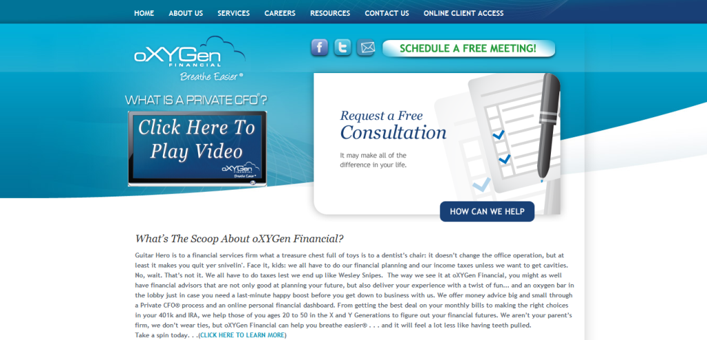
4. oXYGen Financial
The home page offers plenty of opportunities to click to become more engaged with the website or the firm.
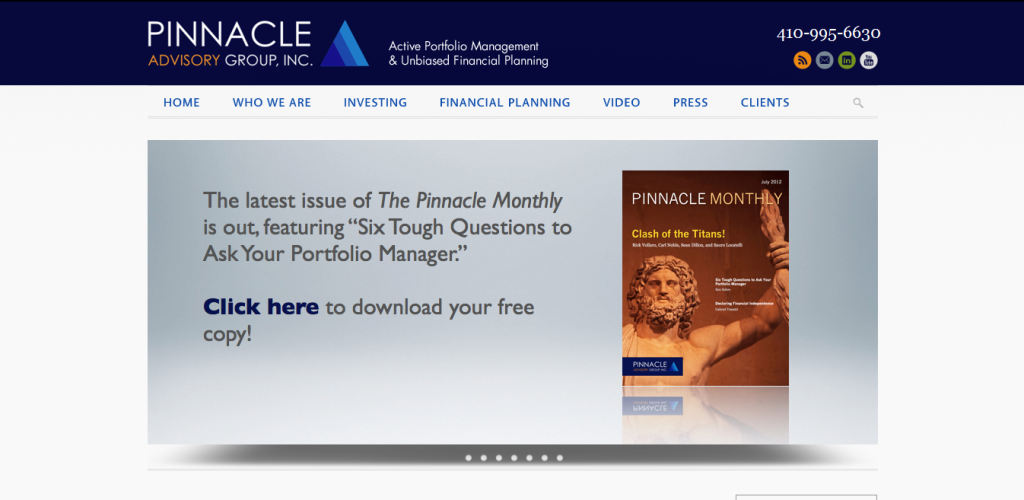
5. Pinnacle Advisory Group
The featured content on the home page is always changing, giving the reader a reason to return. The uncluttered home page features a striking image.
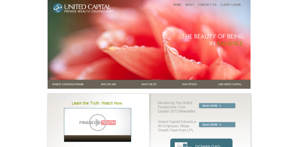
6. United Capital
The home page features a striking photograph along with video and print content to engage readers no matter how they prefer to consume content.
7. Wealthcare for Women
This website uses plain English. You feel that there’s a real person behind it.
What do YOU think?
I look forward to hearing from you.




Thanks for including me along with these other great sites
Well, I have worked for two respected global managers in Boston, and while #1’s site is nice and clean looking with a solid tagline, they really don’t stand above any other manager in my eyes. They ALL have solid taglines with their clean little logos and try to appeal to the lucrative world of pensions and private wealth. This business is about establishing trust with potential clients- the question is, who is your client base? #7- Wealthcare not only establishes their client base -women- they go about it in a way that is appealing to women. No bull, no fancy talk, just the facts. We don’t have time for anything else and frankly, we can see right through it but since the investment business is still a man’s world…so #7 stands out for me (since I am so intimate with this man’s world). I also like the goldfish- I think it juxtaposes investing with seeking a doctor’s advice in a humorous way but it still establishes trust. #6’s graphic is not good- at first glance it looks like a health insurance website.
Kelly,
Thank you for your great comments!
I think some websites fail to hit the target of clean site with solid tagline. However, as you say, hitting the target is more common among sites aimed at institutional investors.
I wonder if other readers think that #6 looks like a health insurance site. I don’t look at many health insurers’ sites, so I’m not qualified to judge.
I’d agree that sites 3 & 7 are the friendliest of the bunch. Whenever writing copy for reps or others, there is a rule I always try to live by, and that is the words “we,” “us,” “our,” and “I” are not permitted unless it is a personal communication. It truly is all about the prospect or client’s point of view and you need to speak to them and their emotions, regardless of gender. “Chest-thumping” is what I call using the four words listed above, and it doesn’t work in these days when people want to connect, not just transact. At least that’s one opinion on what makes effective messaging.
Garth,
I agree. But it’s hard to convince some clients of this.
Thank you for taking the time to comment!
Susan
Thanks for this post. We are in the midst of a website upgrade and this is very helpful.
Garth,
I’d be curious to know how you define “personal communication.”
There are some places where you can’t avoid I or we for compliance reasons. For example, those classic “we believe” sentences are essential to discussions of investment philosophy.
If you liked this post, you may also enjoy Amy Buttell’s “3 Tips for How Financial Advisors Can Serve Up a Fresh, New Website,” which includes links to advisor sites and a couple of articles about advisor websites (http://www.clientwise.com/Blog/bid/75702/3-Tips-for-How-Financial-Advisors-Can-Serve-Up-a-Fresh-New-Website)
Susan,
I’m currently working with an RIA to update website, prospecting and template communication copy. So in cases where the communication is meant one-to-one, as in a template letter or e-mail, it is proper to use one of the four “forbidden” words. That doesn’t mean the rest of the copy doesn’t avoid them, but when necessary, they have to be used as you point out. Making this even more challenging, they like to use a team approach and include multiple signatures on letters…
Thank you for continuing the conversation, Garth!
This is very interesting viewing from the UK – here are a couple more from over the pond
http://www.trustedadvisor.co.uk
http://www.carbonfinancial.co.uk
http://www.bloomsburyfp.co.uk
and our own
http://www.capital.co.uk
any thoughts?
regards
Alan
Alan,
Thank you! I’ll try to look at those sites. I like the sentences–like “We care about
your life, not just your capital”–that rotate through the big picture box on your home page.
Hi Susan,
Enjoyed the post and hope you don’t mind me weighing in since I spend a lot of time helping advisors develop branding, marketing themes, messaging, blogs and websites.
I think Russ and Brian have done a nice job creating a simple and personable approach with their sites. An individual advisor’s site is going to have the chance to be more personable than a corporate or firm site by default. They both have one main (and simple) call to action, so it’s pretty clear what they want you to do. If it were me I would ask for more than an email address though and provide a special offer (consumer guide) in exchange.
OxyGen does an awesome job with relevant calls to action and forms that ask for enough data to qualify a visitor! Their text font is way too small and there is too much of it, however. I’d also love to see more of a human element here that is readily visible, and that will build greater trust. Show us prominently who the “people” behind the brand are so we don’t have to go on a treasure hunt!
The rest of the sites look nice from a design perspective, but in my opinion they have so much information that it’s not clear what to do next, and very easy to get lost.
Less is truly more, especially in a world of information overload.
The new websites will be simple, clean, and clear without clutter and jargon. They will highlight one or two primary benefits that the advisor or firm brings to the table. In addition they will have no more than a few clear calls to action for what a visitor should do next. (we are currently redesigning our main company site to reflect this principle as well!)
Without a blog to publish interesting and relevant content on a consistent basis, it’s tough to establish yourself as a thought leader and drive traffic to a static website. Maybe I’m missing the blogging component but I did not see it on some of these sites.
Stephanie
http://www.stephaniesammons.com
Stephanie,
Thank you very much for your detailed reply! Like you, I’m a big believer in “simple, clean, and clear without clutter and jargon.”
Hi Susan,
Thanks for showing these sites. I have a few favorites too. I like this website – different, clean, refreshing, and it speaks to me.
bluesparkfinancial.com
-Mindy
Mindy,
I like the emphasis on “you” on the home page of http://www.bluesparkfinancial.com/. Thank you for sharing!
Susan– Great test. It hits on a lot of the key points I teach in my Effective Web class, based on my work in writing custom Web content and suggesting web design, services I’ve provided to individuals, non-profits and major corps since the 90s.
Two sets of comments:
q) The options you’ve provided. #1 is too sterile. Looks like a thousand others, with no hint at why I should hire this company vs. its competitors.
The Wealthcare for Women is great! Addresses a specific niche, copy is neat and uncluttered, everything about it wants me to find out more.
I also like the oxyGen. It doesn’t hit me with the video, screaming at me as soon as I tune in. Instead it gives a choice as to IF or WHEN I want to see it. That sort of teases me to access it. (I might choose a different background, though.)
b) Everyone should remember it’s no longer a matter of posting a site. The web is now swimming with sites, including small businesses. The question is what are you doing to drive people to YOUR site? (Another class I’ve taught.) It could be as simple as having a more effective business card to entice people to look for your site, to creating a newsletter. Don’t think you can’t afford the latter; it can a simple one-pager or a 4-pager you create by teaming up with two other business owners whose work complements yours.
Trust that helps. — Wendy Meyeroff, Piggy Bank Promotions
Wendy,
Thank you for your insightful comments!
Sorry about the glitches with my blog publishing your comments. I appreciate your persevering to get your comments up.
Susan