Tips for crowdsourcing self-published book covers
When you’re not a publishing or design professional, it’s hard to make decisions about covers for your self-published books. I’ve turned to my connections for feedback on the design and text on many of my book covers. Crowdsourcing your self-published book covers may help you to make valuable refinements.
My crowdsourcing experiment started with the very first cover for Investment Writing Top Tips. When I decided in 2011 to add a professionally designed cover, I needed help choosing an image from the library of image offered by my designer. Back then, I relied on the members of my mastermind group to help me decide. These days, I’m more likely to put out a call on social media.
Questions to ask when crowdsourcing your self-published book covers
Some questions work better than others. Don’t ask a big, open-ended question, such as “What should my book cover look like and what exactly should it say?” Well, you could ask that. You might even get some useful answers, even though you’re asking a lot of your readers. However, you’re more likely to get useful answers if you ask narrower questions (accompanied by images), such as
- Which of these three images do you like best for my book cover?

My Facebook post asking for help with the call to action for the 2013 edition of Investment Writing Top Tips
- Which of these three cover designs do you like best?
- Do you see anything I should improve on in my first version of the cover?
- Can you suggest any tweaks to the text on my book cover?
To the right you’ll see what I posted on social media when seeking help with the call to action for a past edition of my Investment Writing Top Tips.
Beware: You’ll get contradictory advice
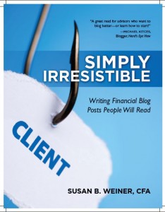
It’s hard to please everybody with your cover design and text. When I worked on the cover of Financial Blogging: How to Write Powerful Posts That Attract Clients, some people loved the image of a fishhook through a piece of paper saying “client.” Others hated it. They felt that the fishhook was too violent.
The crowd also expressed dissatisfaction with my original book title, Simply Irresistible: Writing Financial Blog Posts People Will Read, because it failed to highlight my topic. This was especially true with the way the text fit onto my cover. You can see the initial design below.
Ultimately, the decisions are up to you. I changed my book title to feature “Financial Blogging.” I also went with the fishhook image, but asked my designer to soften its point, which now blends into the black area at the top of my cover. That’s a refinement I wouldn’t have thought of, if I hadn’t crowdsourced feedback on my self-published book cover.
Reminder: Your title text should be big enough
You can save your crowd from the need to correct you if you make your title big enough on the cover of your self-published book. Your book cover is an important part of your book’s marketing. People won’t buy if your title isn’t big enough when they see it as a thumbnail image on a web page.
More tips for self-publishers and book authors
Here are posts about other lessons I’ve learned from publishing:


