How and Why to Use Sliding Pop-ups
Email lists are a key part of online marketing for financial advisors—and for me, too. I was intrigued when advisor Dave Grant told me on Facebook that he was using a sliding pop-up with a chat function to get more mileage out of his website. His guest post below resulted from our discussion.
How and Why to Use Sliding Pop-ups
By Dave Grant
One problem advisors have is building a credible email list in order to share their thoughts with a list of prospects to ultimately gain new business. The old way was meeting someone and then asking to add them to your mailing list. But in the age of more interaction online, you need a way to capture visitor information of those whom you may never meet in person. This is where pop-ups come in.
By offering a newsletter / free report / video series for visitors to your website, you can obtain their names and email addresses to add them to your list and, potentially, a drip marketing campaign. However, static opt-in boxes are often ignored, so how do you get that valuable information?
It may be time to use a pop-up. Pop-ups on websites can be annoying, but they have been proven by multiple marketing studies to increase visitor engagement through newsletter opt-ins because they are dynamic on the page. Instead of a pop-up in the middle of the screen, there is now an alternative that’s less annoying but still effective: the sliding pop-up.
Usually situated in the bottom left- or right-hand corner of a website, this box can transition in after a set period of time or when someone hits the end of the page, making readers notice the opt-in box. However, it’s not annoying like a traditional pop-up that blocks the reader’s view of the screen. When you use your company’s branding on these opt-in forms, they look like an extension of your site rather than a standard opt-in form. Many advisors find pop-ups increase their newsletter opt-in rates.
I’ve taken the pop-up one step further by adding a chat program.
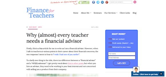
While I still have static opt-in forms on throughout my site, I use the sliding pop-up on the bottom of my screen with a chat program. When people get to the end of an article, or after a set time period, the chat box slides up and I introduce myself with template text. From there, people can ask questions and interact with me in real time. Look at the image to see a screenshot of the initial view of my pop-up. Notice “Click here to get help” in the lower right-hand corner? That’s where you can start to chat with me.

I’ve seen my conversations, not just opt-ins, with potential clients increase dramatically using this method. Now my website averages one good prospect conversation per week instead of the one per month I gained from the “Schedule an Appointment” button on my website.
If you’re wondering how to implement this strategy, there are many sliding pop-up options for advisors who use WordPress. You can download them as a plugin and adjust the wording yourself. To add your firm’s branding may require a web designer to write some code. Some options include AppSumo List Builder, Bounce Exchange, and OptIn Monster. There are also free options.
For my chat pop-up, I use ClickDesk. I like that it sends a chat transcript to my email once the chat closes.
____________
Dave Grant, CFP(R) is the founder of Finance of Teachers, a fee-only financial planning firm in Cary, IL, serving teachers, primarily in Illinois. He is also a columnist for Financial Planning magazine, writing about issues facing Gen Y advisors. His recent book “The First Year” discusses the challenges of the first year of running his RIA, tips on how to be successful, and is available on Amazon Kindle, iBook, and through The Mercato.


