Looks matter: Pick your fonts wisely
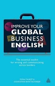
Even though I’m a word nerd, I believe that their visual appearance matters to how effectively words communicate. The section on fonts in Improve Your Global Business English by Fiona Talbot and Sudakshina Bhattacharjee reminded me of this.
Fonts matter because the right choice of font makes your material easier to read.
Fonts also convey a message. For example, the authors note that “Times New Roman is readable but can seem old-fashioned these days.” That must be why my friendly presentation pro suggested I switch my PowerPoint slides from Times New Roman to Verdana.
To learn more about what your fonts say about you, check out:
- “What does your typeface say about you?” on prdaily.com
- “10 Iconic Fonts and Why You Should Never Use Them” on webdesignerdepot.com
- “Typeography psychology: What does your typeface say about you?” on minnpost.com
- “What Font Should I Use?”: Five Principles for Choosing and Using Typefaces” on smashingmagazine.com
What fonts do YOU favor?
If you know what fonts you use in your communications, please comment. If you’re knowledgeable about fonts, I’d like to learn from you.


A couple of years ago, a well-known expert on fonts (based in Chicago,forgotten his name) said that Georgia is the best font for reading on a computer. I like it but I have had complaints.
Russell,
That’s interesting. Do the complainers say why they object to Georgia?
I’m not a font expert. I only know that some fonts are too gimmicky or complex for me to read easily.
Thank you for taking the time to comment!
I just googled “Chicago font guy” and found this expert, Phinney. Font is only the beginning. He talks about font height, thickness, line spacing, letter and word spacing, line length, and the color of the text and the paper. Now I’m puzzled. Maybe the Georgia font isn’t the problem. Maybe it’s these other variables that are damaging readability. I use 12 point by the way.
Interesting. I just found Thomas Phinney’s blog (http://www.thomasphinney.com/)about fonts, but it doesn’t seem to be very active.
I received a questions about buying fonts. I stick with the fonts that come with my software. However, some online colleagues suggested the following sources:
http://www.google.com/fonts
http://www.fontsquirrel.com/
http://www.typography.com/cloud/welcome/
http://www.fonts.com/
http://www.myfonts.com/
Here’s an interesting infographic about the psychology of fonts, which I discovered through Blane Warrene on G+: https://plus.google.com/u/0/+BlaneWarrene/posts/jWs5AGzeejF?cfem=1
“Fonts have feelings too” is a fascinating article about fonts and layout: https://medium.com/who-what-why/1523564d966c